Overview
With CCW Vegas, the world’s largest customer experience event, just around the corner, Tenyx saw a major opportunity to refresh their digital presence. With a website that hadn’t been touched since launch, it no longer reflected their growth or current product offerings. Because of this, a redesign became a top priority. And with only one month until the event, we had to move fast.
I led the full website redesign and brand refresh, ensuring Tenyx’s new identity was reflected across all touchpoints. To meet the deadline, I enlisted the help of our design team to update email and pitch deck templates, social assets, and even Tenyx’s physical booth for CCW Vegas.
This redesign marked the first step in a broader marketing push that led to a feature in Forbes and, just months later, Tenyx’s acquisition by Salesforce.
-11% Bounce Rate
+21% Pages Per Session
+28% Scheduled Demos
Company
Client
Team
Timeline
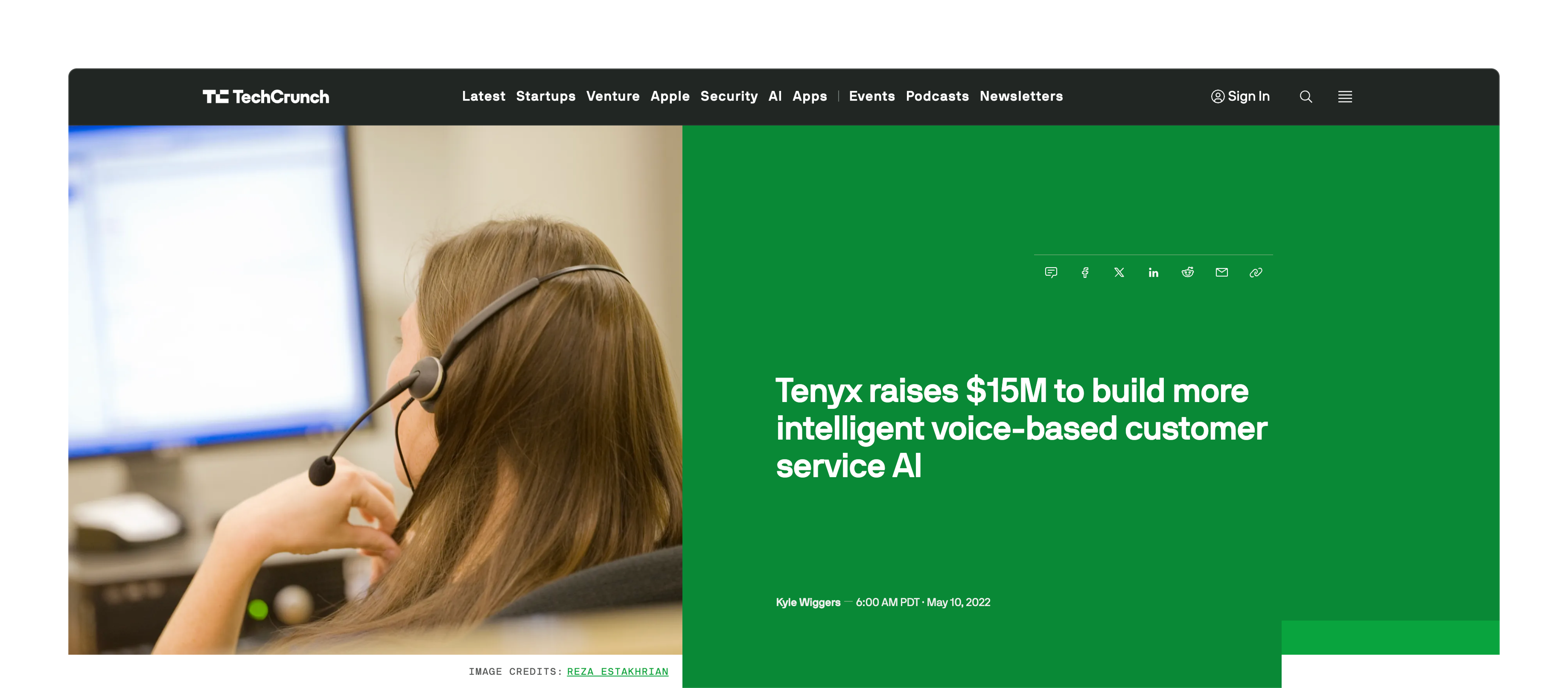
Tenyx's funding press release on TechCrunch
Tenyx had just one month to transform its brand and website for CCW Vegas.
A high-tech company with a low-impact site.
For a company pushing the boundaries of conversational AI, the site felt outdated and wasn’t effectively communicating its innovation.
Digging into analytics and conversations with the Tenyx team, I uncovered three key issues: low engagement above the fold, weak calls to action, and outdated content that no longer reflected the company’s growth. These were areas I needed to address in order to create a stronger first impression and drive more meaningful engagement.
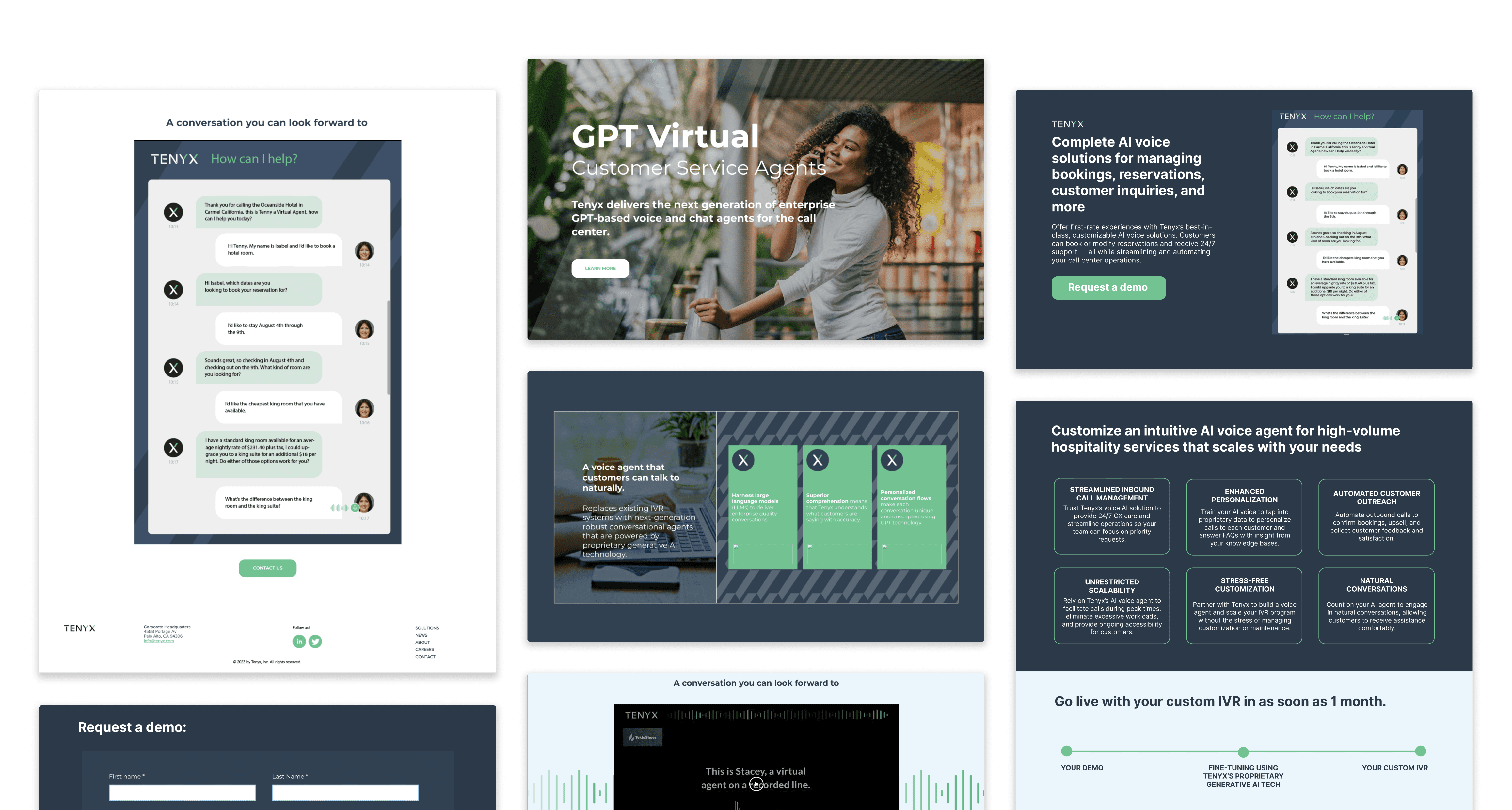
The previous Tenyx website
Some of our key objectives for this project.
This wasn’t just about making the site look better - it was a full content overhaul.
Setting the foundation with the right content strategy.
Since the site's messaging would shape its visuals and overall tone, my first priority was nailing the content strategy. Luckily, Tenyx had a strong understanding of their customers, which made identifying key audiences and figuring out how to speak to them much smoother.
One early challenge was striking the right balance in tone. Should we lean into the cutting-edge AI side or focus on connecting with CX managers who might be less tech-savvy? While we hadn’t locked in a direction just yet, we knew the content had to feel both approachable and innovative - something I kept top of mind as we moved forward.
Working in Google Docs was the easiest way to get everyone involved
Mapping out the structure.
With the content strategy locked in, it was time to figure out how everything would come together. I began by creating a high-level site map to define the basic structure of the site.
I then put together wireframes to get a feel for the layout, flow, and making sure each piece of content had its rightful place. Fortunately, the Tenyx team was on board with the first round of wireframes, giving me more time to focus on the fun part: exploring the visuals.
A high-level sitemap defining the new website structure
Initial wireframes visualizing the layout and flow
Crafting Tenyx's personality, starting with the hero.
As the first thing visitors would see, the hero needed to make an impact while setting the stage for the rest of the site.
I explored dozens of variations - tweaking colours, layouts, typography, and the best way to showcase our demo. I ultimately landed on two visual directions:
Dozens of design explorations to find the perfect fit for Tenyx's audience
A fresh look for Tenyx’s next chapter.
Striking the right balance.
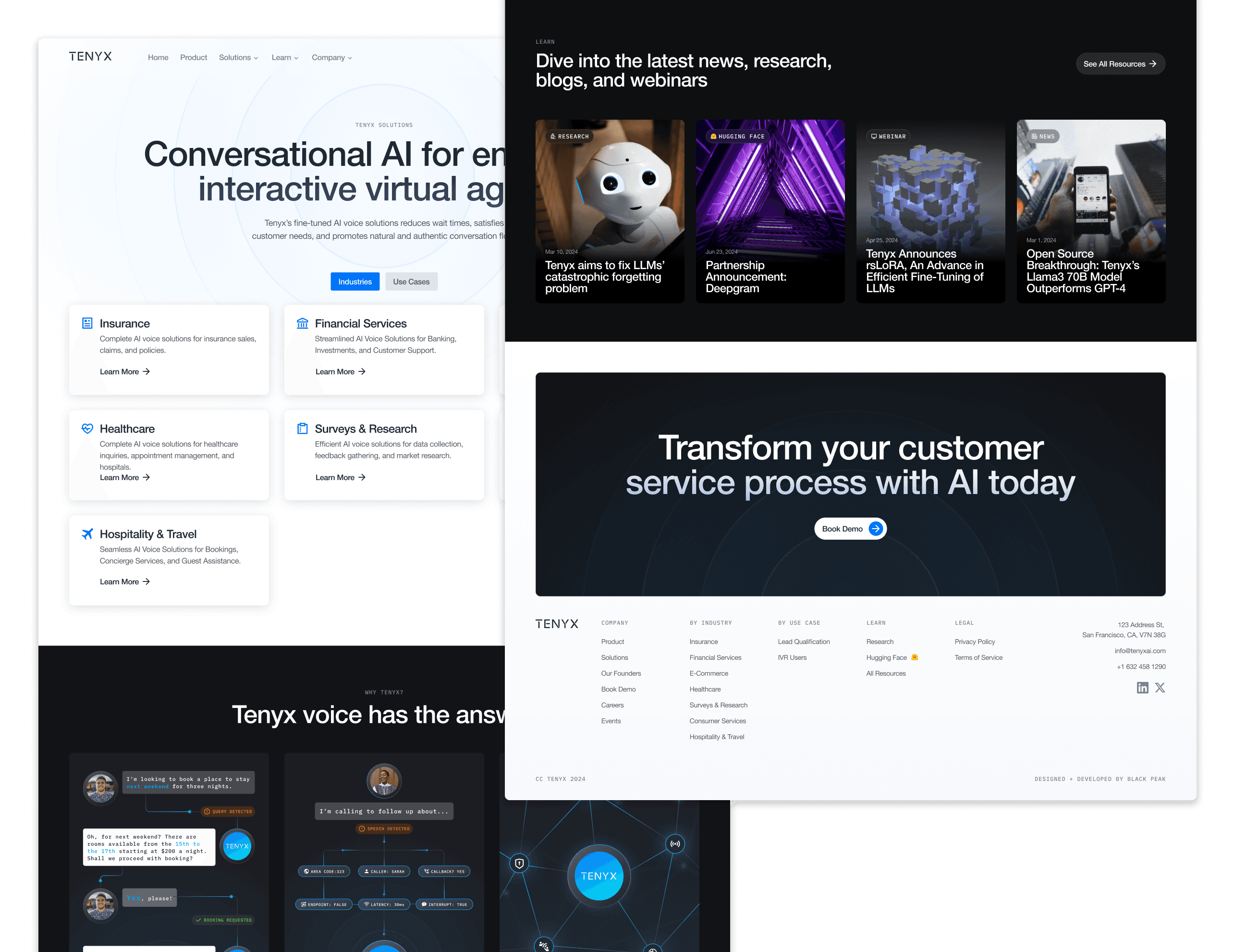
After much discussion, we decided to embrace both visual directions. Dark mode set the tone for tech-focused sections, emphasizing Tenyx’s cutting-edge AI, while lighter sections highlighted real-world benefits, making the site feel more approachable.
This mix helped us find the sweet spot for keeping the site accessible to both technical and non-technical audiences alike.
Balancing dark, tech-forward elements with approachable, light sections
Bringing Tenyx’s AI to life.
To showcase Tenyx’s AI in the best way possible, I created an interactive demo using their audio samples. There were plenty to choose from, but I selected the one that best set them apart from their competitors - highlighting the human-like speech, natural flow, and ability to remember past conversations.
By embedding this demo right into the hero section, visitors could experience Tenyx’s capabilities firsthand - seeing not just how it works, but how it could benefit their business.
Giving users a firsthand experience of Tenyx
Other sections of the site showcasing both dark and light themes
Ensuring the new site is just as engaging on smaller screens
I kept a close eye on our key metrics 3 months after launch, here are the results.
-11%
BOUNCE RATE
Compared to the previous quarter, Tenyx saw a noticeable drop in bounce rates. This told us that the redesigned homepage and clearer messaging were doing their job - engaging visitors from the moment they landed on the site.
+21%
PAGES PER SESSION
The improved site architecture made it easier for users to explore more of the site. This boost in engagement indicated that visitors were finding value in the content, which led to more informed and qualified leads.
+28%
SCHEDULED DEMOS
After the redesign, scheduled demo requests - Tenyx’s most important conversion metric - saw a significant boost. This was a clear sign that our approach to communicating the product’s value was working.
Just in time for CCW Vegas.
Despite the tight deadline, I managed to pull off the redesign just in time for CCW Vegas, where Tenyx got to unveil their fresh look and website to a live audience. I couldn’t make it in person (being all the way in Canada), but the team was awesome enough to send over videos and photos of the big reveal!
The launch also showcased the work of our design team. With my guidance, we made sure everything - from the booth design to the pitch decks - was fully in sync with the new brand direction.
The Tenyx booth at CCW Vegas
A major leap forward for Tenyx.
The redesign was just one piece of Tenyx’s bigger marketing campaign. But many of the visual assets I created ended up being featured in major publications like Forbes, showing off their refreshed look.
This helped set the stage for Tenyx’s biggest achievement to date: their acquisition by Salesforce in September 2024!
Press releases on Forbes and Salesforce
My three key takeaways from this project.
Delivering under pressure
Handling the tight deadline strengthened my ability to communicate, collaborate, and make quick yet thoughtful decisions under pressure. Seeing everything come together just in time for CCW Vegas will always be a highlight of my design journey.
Appreciation for AI
Working with Tenyx deepened my understanding of conversational AI and LLMs, helping me design visuals that made complex concepts accessible. While I’m not an expert (yet!), this experience sparked a strong interest in AI and gave me confidence in designing for the space.
Design in the real world
Seeing my designs come to life in the real world, made the impact feel tangible. Contributing to Tenyx’s marketing efforts, from press assets to their eventual Salesforce acquisition, reinforced how design can shape perceptions and drive success.

