
Overview
ENVLaunch was built to help studios manage production environments. But as adoption grew, scaling became increasingly difficult. Instead of configuring environments independently, other studios frequently relied on our technical team for support, creating inefficiencies that slowed everyone down.
To solve this, I led a comprehensive redesign of ENVLaunch’s Launcher and Admin Portal, improving workflow efficiency and empowering studios to manage environments themselves. At the same time, I overhauled our design system to unify ENVLaunch and our product ecosystem under a shared framework.
$173K Projected Annual Savings
+35% Admin Portal Adoption
-43% User Setup Errors
Company
Team
Timeline
A tool designed to simplify production workflows was making our lives harder.
The invisible backbone of animation production.
In large-scale animation production, like AAA games or feature films, studios rely on production environments - preconfigured setups that ensure everyone is using the right tools, plugins, and configurations so their work remains compatible.
Without environments, even a small mismatch - like an outdated plugin - can break assets or corrupt files. Scale that across hundreds of artists working in a studio, and these small issues turn into major production bottlenecks.

Production environments ensure tools like Maya are compatible across entire studios
That's where ENVLaunch comes in.
ENVLaunch helps studios manage their production environments through two key parts:
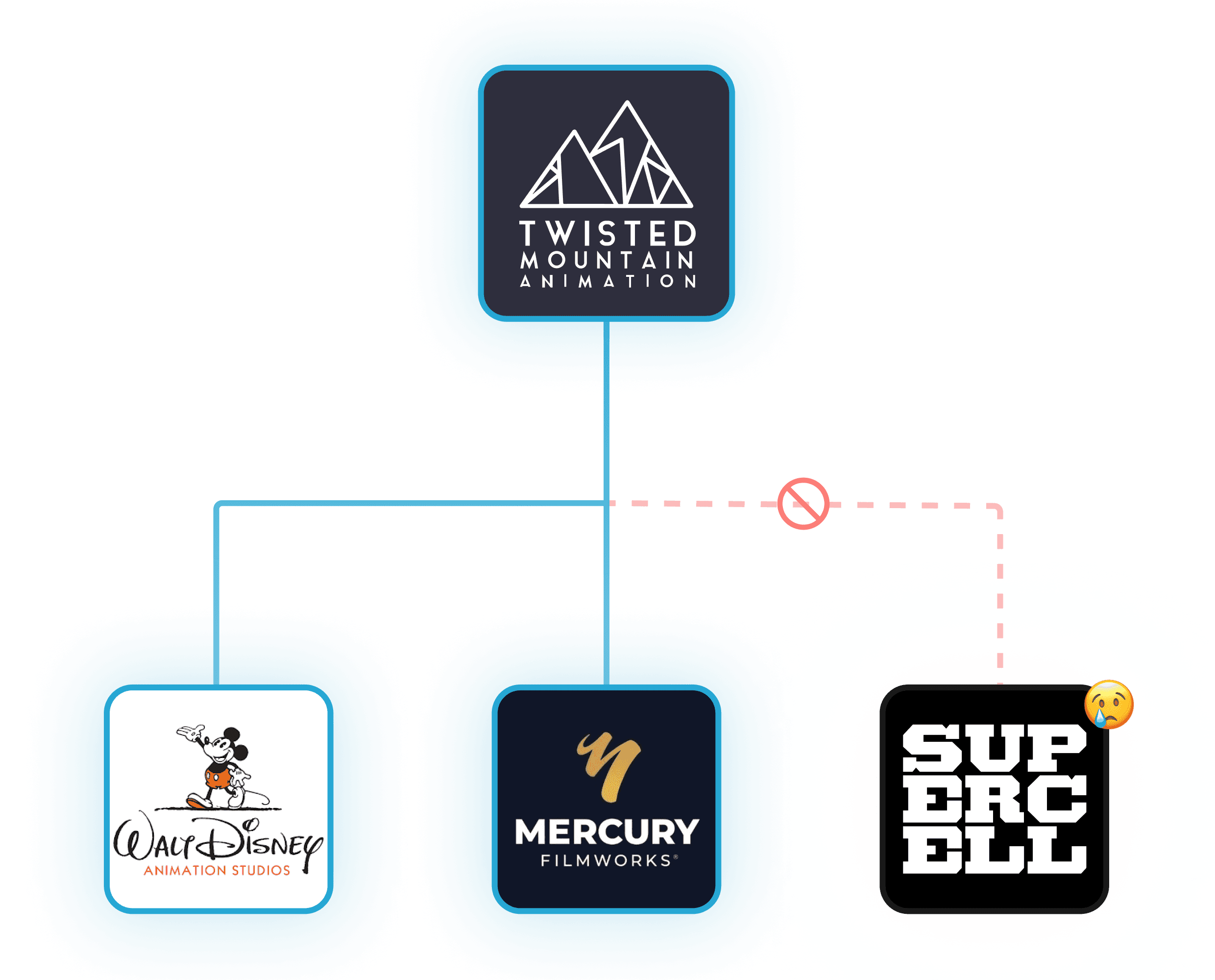
It was originally built as an internal tool to help our own studio, along with our friends at Disney Animation, Supercell, and Mercury Filmworks, manage environments more efficiently.
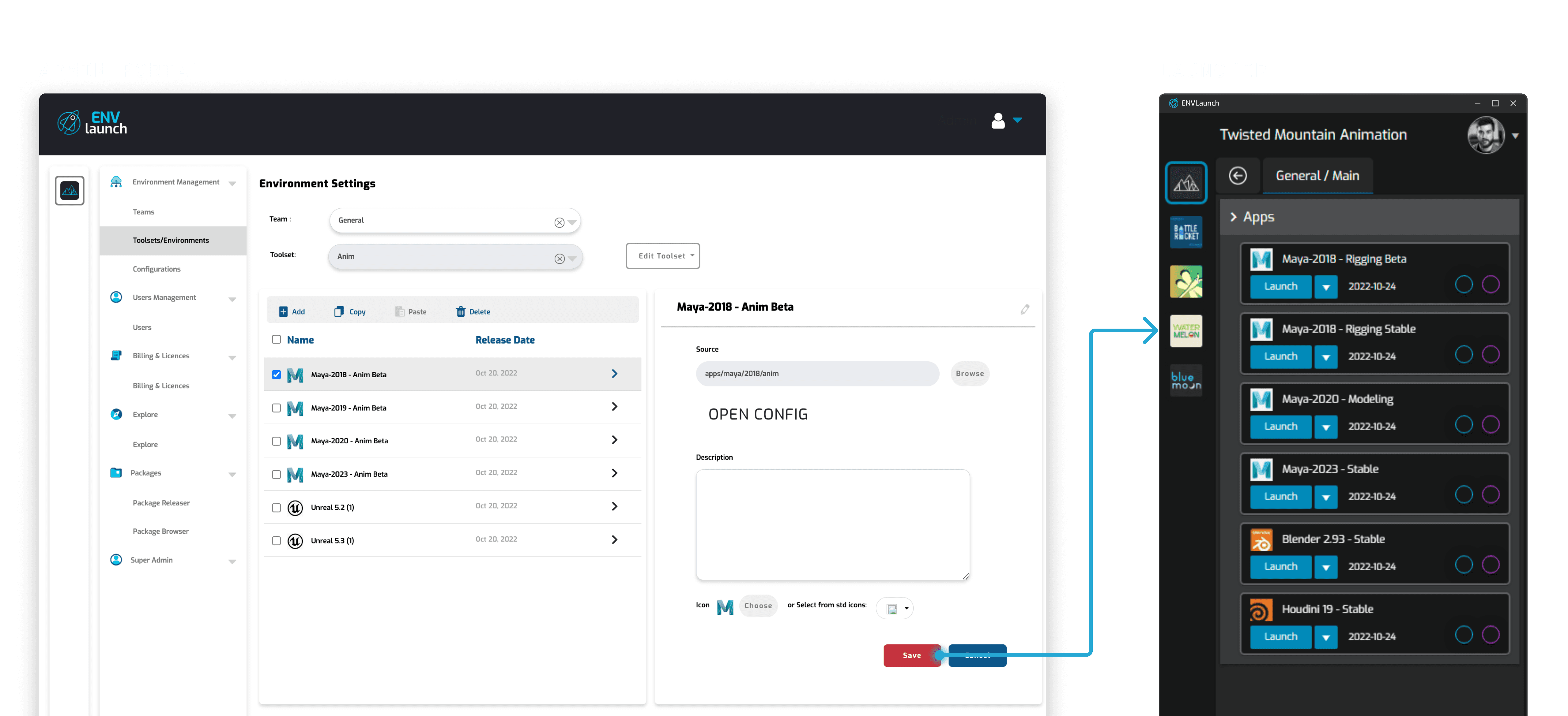
The existing Admin Portal and Launcher
But as more studios adopted it, the cracks started to show…
The clunky workflows and poor usability made ENVLaunch frustrating to use. In fact, we knew exactly how frustrating it was - because some studios found it easier to have us configure environments for them instead of using the platform themselves.
This was manageable at first, but as more studios came on board, one thing became clear - this wasn't sustainable.
Which brings us to the problem I set out to solve…
How might we simplify environment management to reduce inefficiencies as more studios adopt ENVLaunch?
To understand where things were breaking down, I dug into Jira tickets, user logs, and internal time tracking data. The patterns became pretty clear…
$250K
was lost annually as our technical staff spent 20-25 hrs/week managing environments for other studios.
SOURCE: QUICKBOOKS
40%
of all environment setup attempts resulted in errors, causing costly production delays.
SOURCE: SENTRY.IO
27%
of reported issues were tied to usability challenges in the Admin Portal.
SOURCE: JIRA
What was meant to make environment management easier for studios ended up creating more work for our team. Without a redesign, scaling ENVLaunch would’ve meant expanding our technical team just to keep up.
What this all leads to - our goals for this project.
I first needed to understand where users were struggling, so I went straight to the source.
The research approach.
What’s one of the best things about working in an animation studio as a product designer? Direct access to our users.
We weren’t just building ENVLaunch - we were using it ourselves. A quick Slack message was all it took to hop on a call with someone who relied on it everyday. To get a broader perspective, I also reached out to other studios using ENVLaunch, uncovering common pain points across different teams.
I focused on user interviews and observational research, ensuring I wasn’t just hearing about problems - I was seeing them firsthand.

Our users were a quick Slack message away
Insight 1: The Admin Portal was frustrating and error-prone.
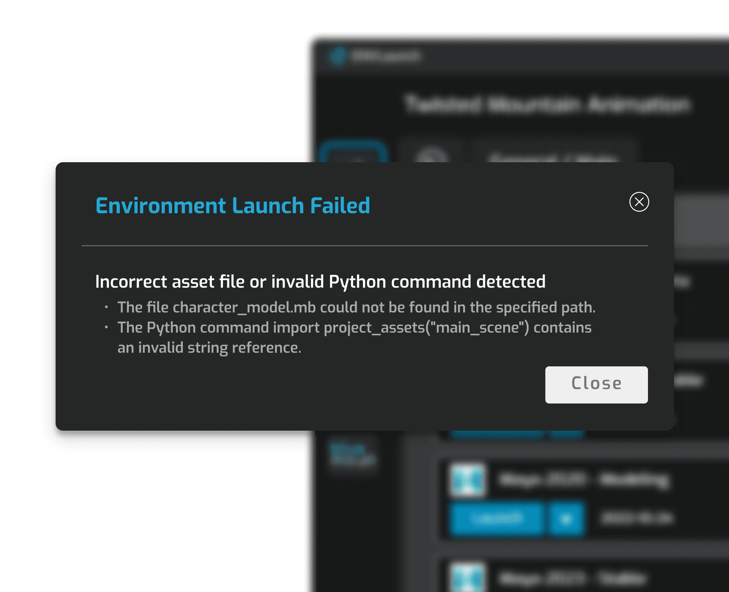
Through interviews with technical staff, I found that unclear workflows, inconsistent UI patterns, and a lack of error handling left users second-guessing whether issues were system errors or user mistakes.
Strangely, only the Launcher had built-in error handling, meaning technical staff had to test environments locally just to diagnose issues.
1
No distinction between editable and non-editable fields
2
No guidance on what to enter
Insight 2: Artists wanted more control in the Launcher.
17 of the 29 artists I interviewed were frustrated that they couldn’t create or modify test environments themselves. Many of the errors blocking launches were minor issues they could have fixed if they had access.
This challenged our assumption that artists wouldn’t need deeper control, as they were more technical than expected. It also raised an important question - would giving them more autonomy reduce their reliance on technical staff?
Insight 3: Locating environments was harder than it should’ve been.
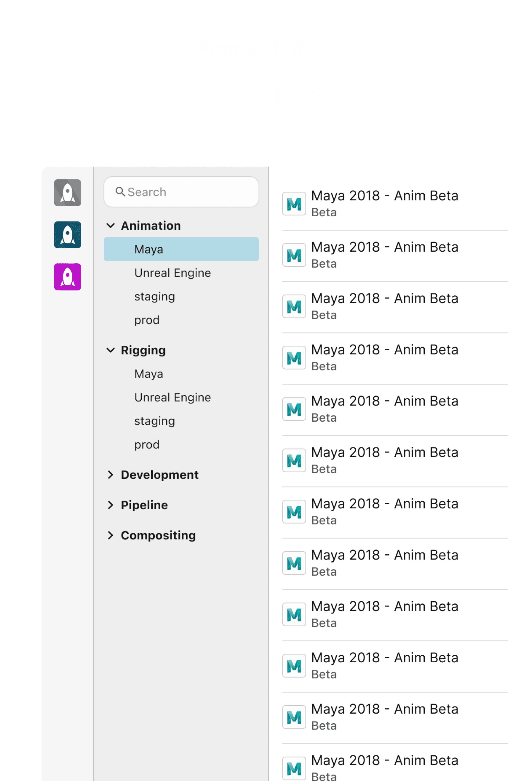
The deeply nested navigation structure forced artists to click back and forth repeatedly just to find what they needed. This was especially frustrating for artists working across multiple teams, who had to navigate between up to 20 environments a day.
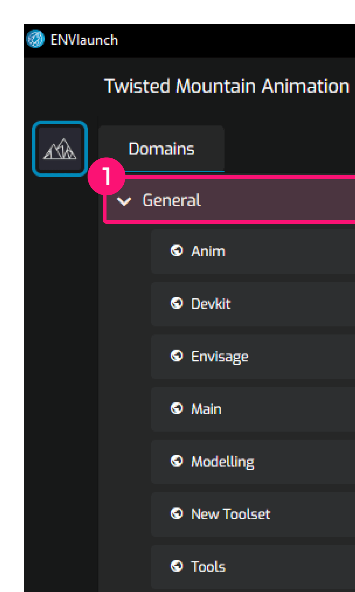

1
Environments are hidden within accordions
2
Too many clicks to switch between environments across teams
Insight 4: The Admin Portal and Launcher felt like two separate systems.
Users found it odd that the Admin Portal and Launcher had completely different UI styles. While this didn’t create major usability issues, it added unnecessary cognitive load for those switching between them daily.
This raised another question - why not take this opportunity to make ENVLaunch feel more cohesive, professional, and visually unified?

These insights helped me map out the entire journey, revealing key areas for improvement.
This led to four design priorities to ensure the project's success.

A full redesign wasn’t realistic - so we had to be strategic.
Balancing impact with a phased rollout.
What started as an Admin Portal redesign quickly expanded when insights from artists revealed broader usability issues with the Launcher.
A full redesign seemed ideal at first, but after working with our PM and engineering team, we recognized the risks - too many changes at once could introduce critical bugs and destabilize the platform.
Instead, we aligned on an incremental approach, prioritizing environment-related flows first for early impact. This meant some areas of the Admin Portal and Launcher would still temporarily retain the old design, but this tradeoff ensured a smoother rollout without disrupting our users.
I worked closely with our PM and engineers to break down tasks and align priorities
By bringing our PM and engineers in early, I was able to hone in on several key approaches.
Making environment configuration easier in the Admin Portal.
For the Admin Portal, I tested two main formats with 12 technical staff members:
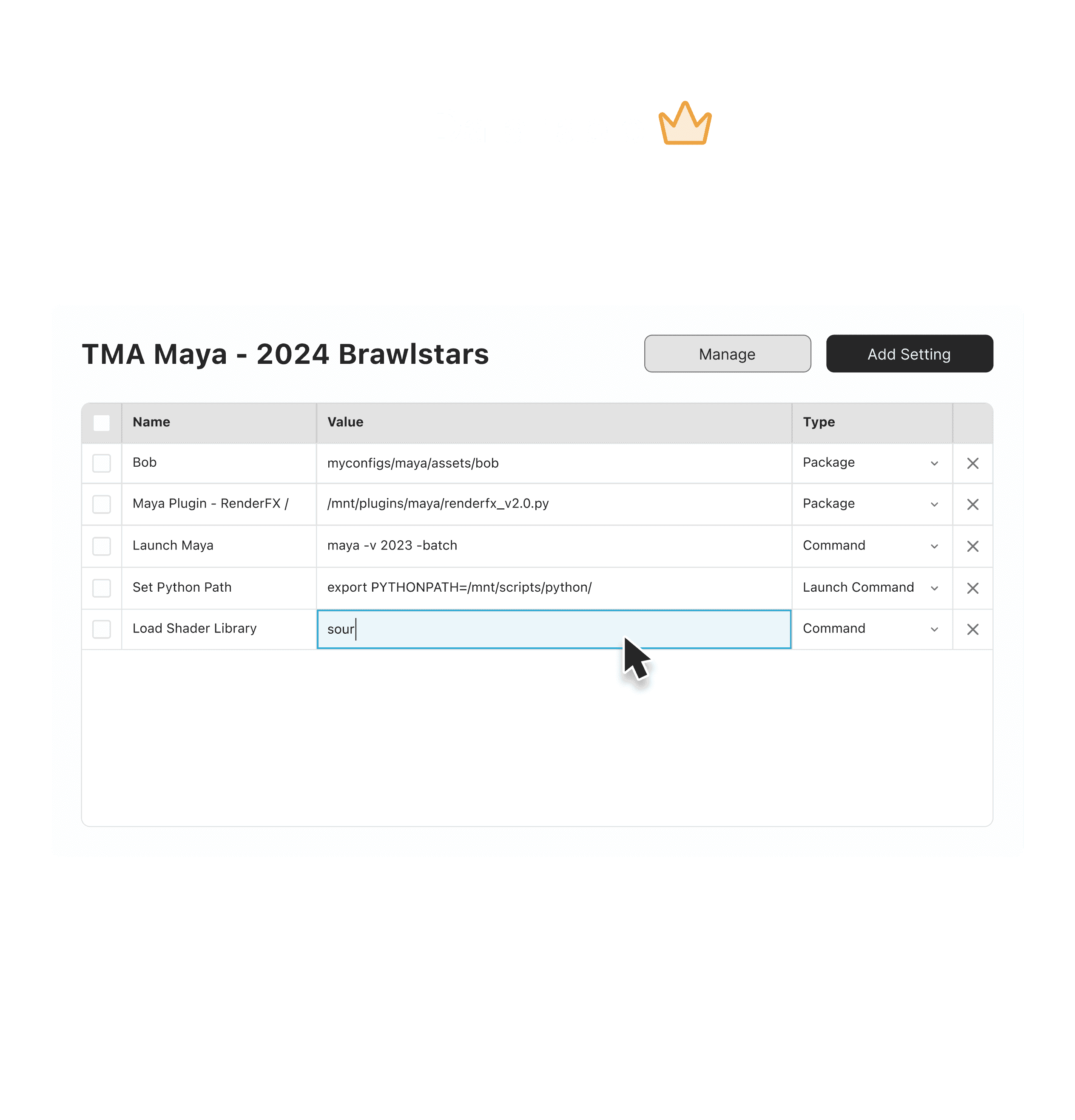
The data table provided the flexibility that technical staff needed
Finding the right navigation for the Launcher.
For the Launcher, I tested three navigation patterns with 10 artists, evaluating how well each balanced visibility and efficiency:

Artists preferred the dropdown for its clarity, even though locating environments took slightly longer compared to the tree view
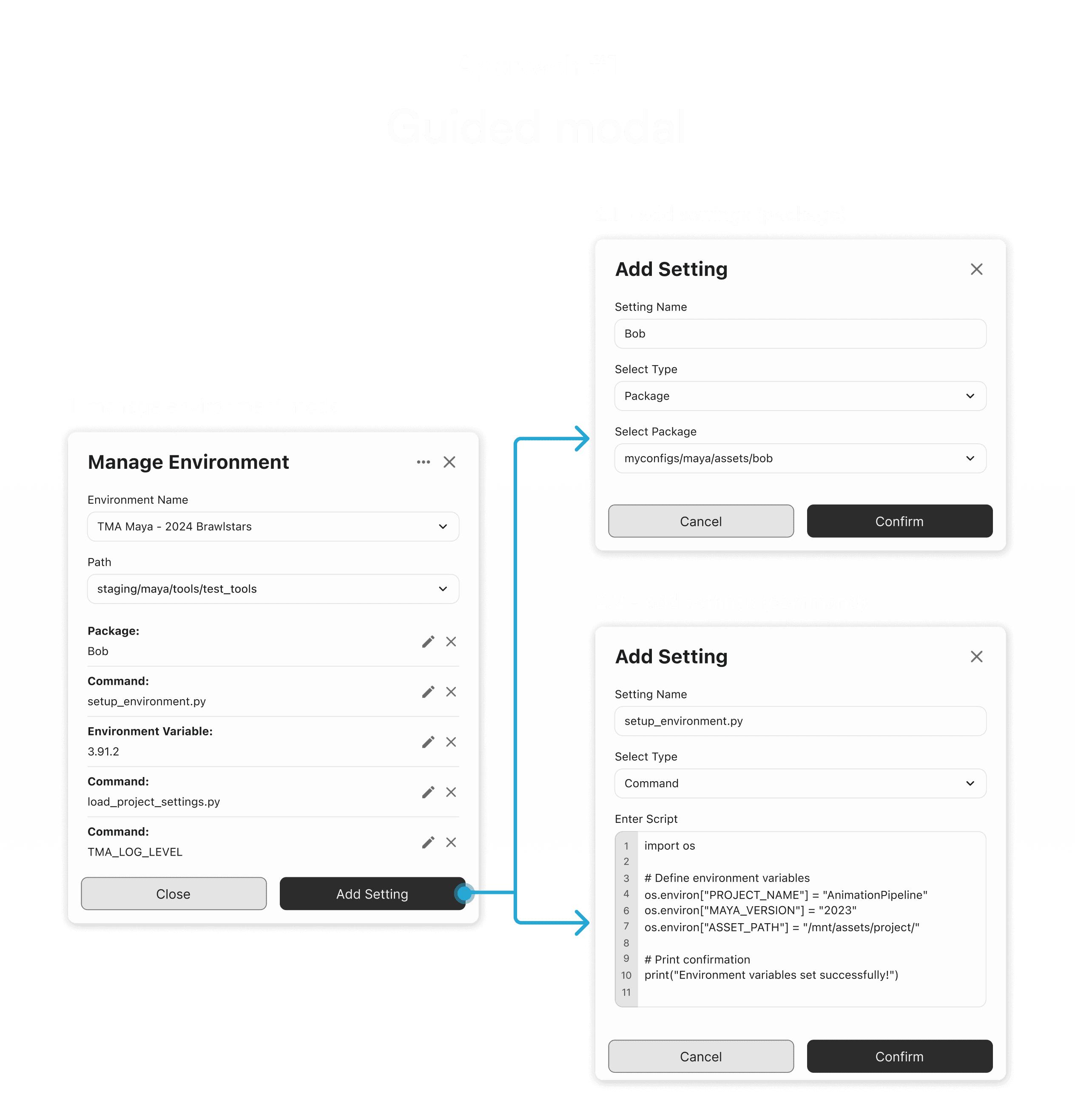
Resolving conflicting user feedback.
When testing ways for artists to create and modify test environments, an interesting conflict emerged - their feedback directly opposed that of technical staff. Artists favoured the guided modal for its structured guidance.
However, implementing both wasn’t realistic given our timeline, and since unifying the experience across tools was a priority, I ultimately decided on the data table format. Technical staff played a more central role in managing environments, so optimizing for their workflow had the greatest immediate impact.


We had to make tradeoffs to move forward, but the guided modal could come back in future iterations
Crafting a unified design language.
Standardizing the UI to eliminate inconsistencies.
Before moving into high-fidelity work, I needed to address a fundamental issue first - all the UI inconsistencies. We had nine different variations of our primary button alone.
Without standardization, developers were creating their own versions, leading to visual inconsistencies and inefficiencies in implementation.
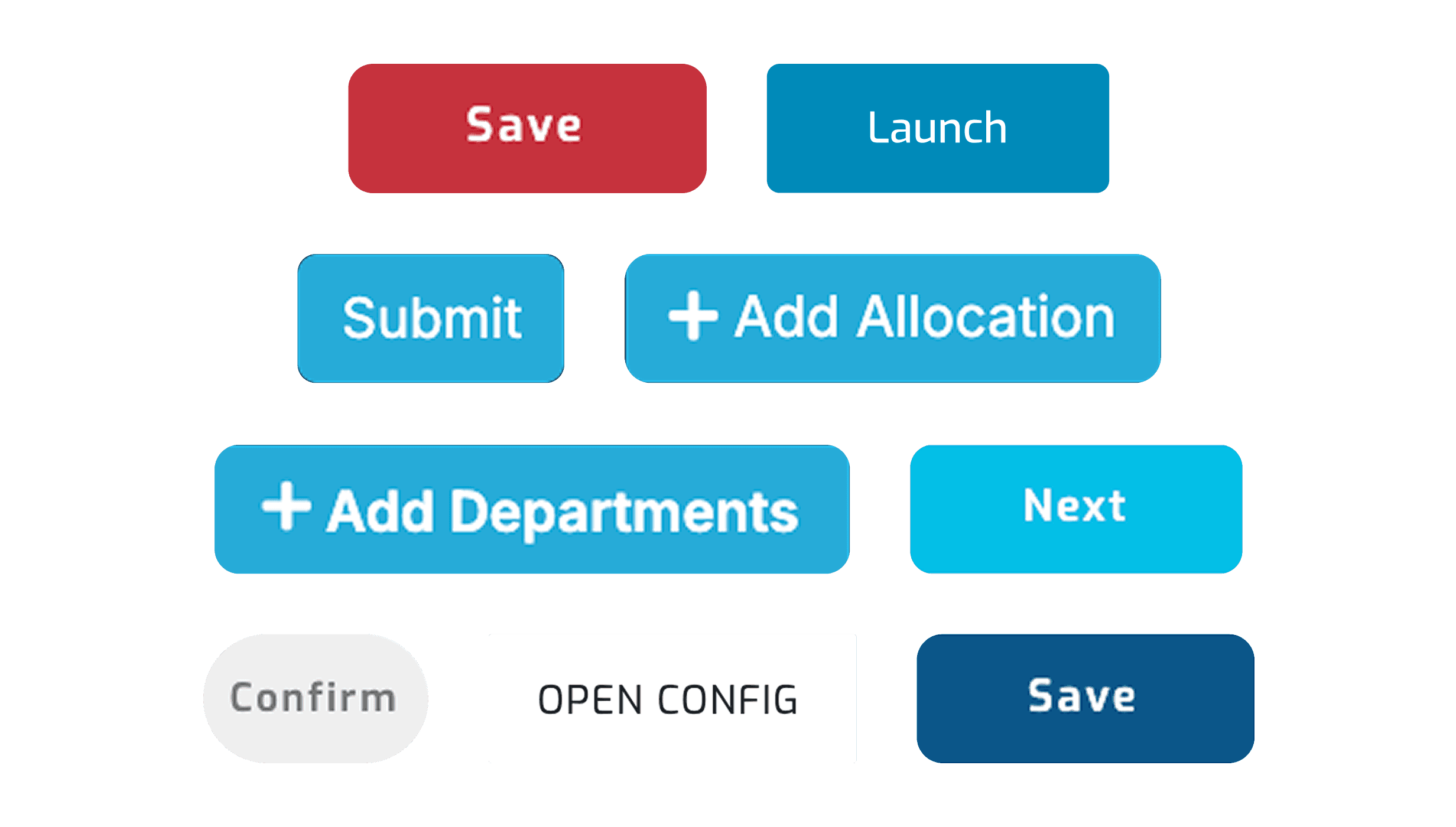
Yes, this was real…
Bringing order to the chaos.
To fix this, I worked with our front-end team to ensure the design system was visually cohesive and practical to implement. Accessibility was also a key focus. Following WCAG guidelines, I ensured our light and dark themes were inclusive to all users.
With the design system and insights guiding the way, I had everything I needed to move forward.
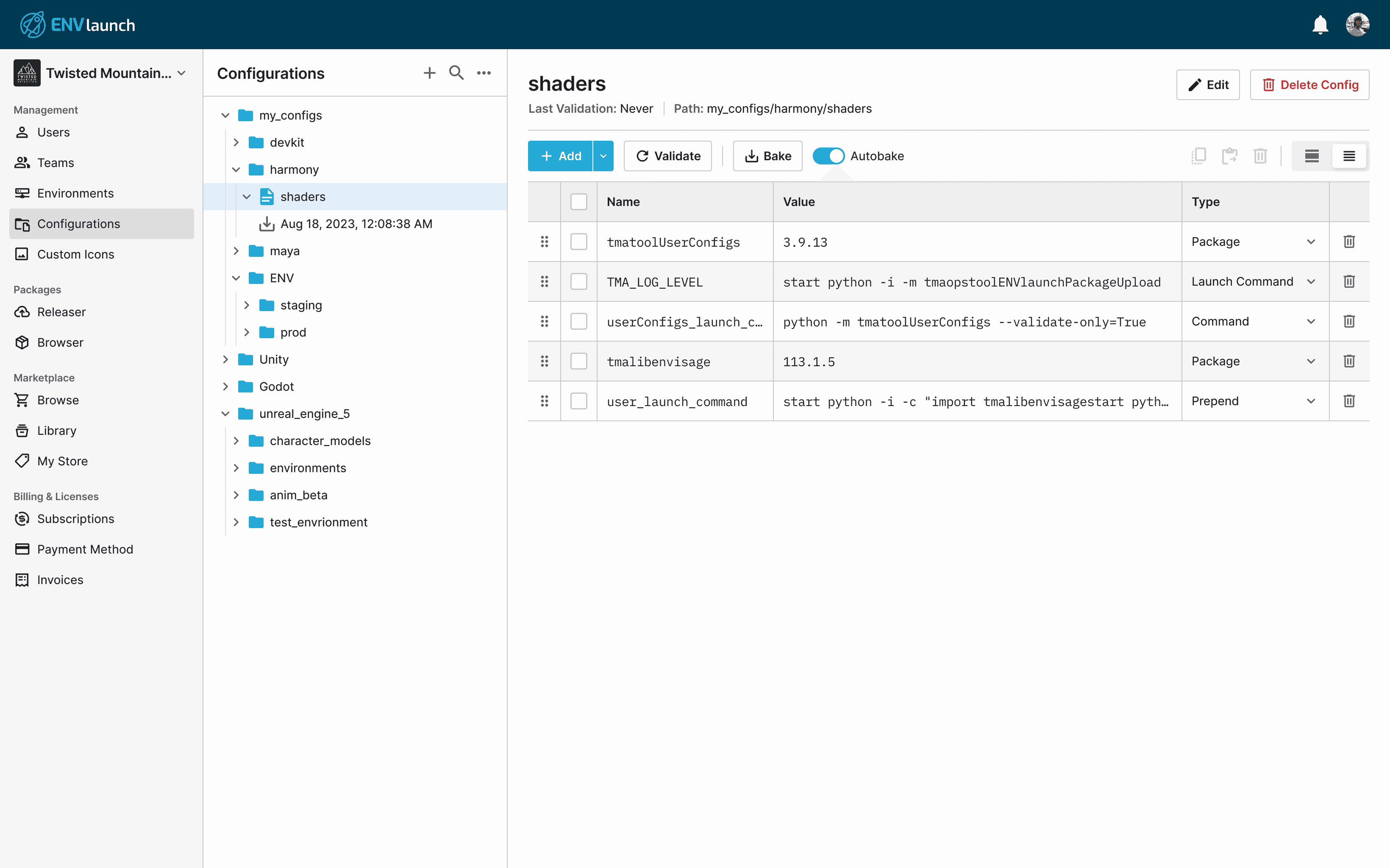
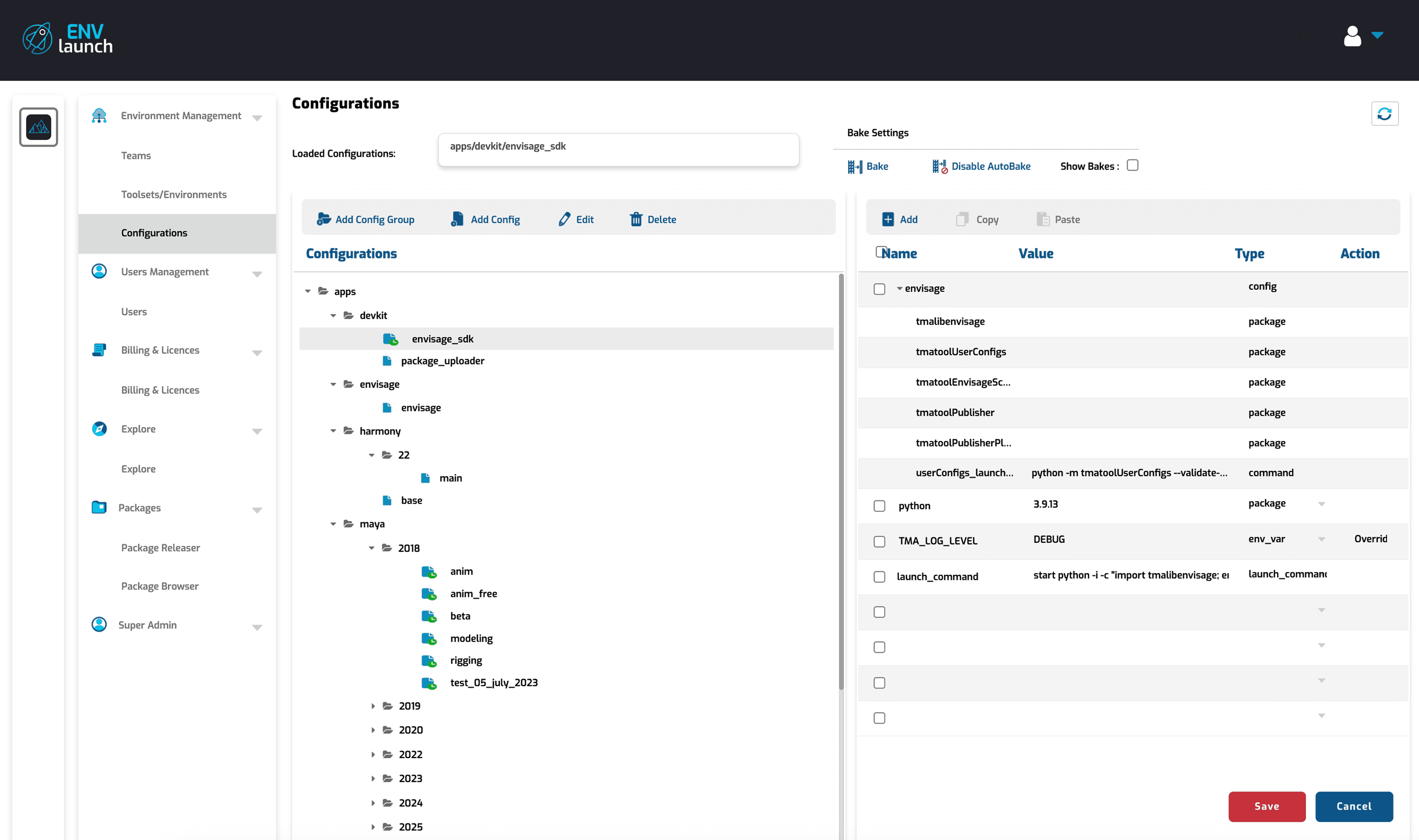
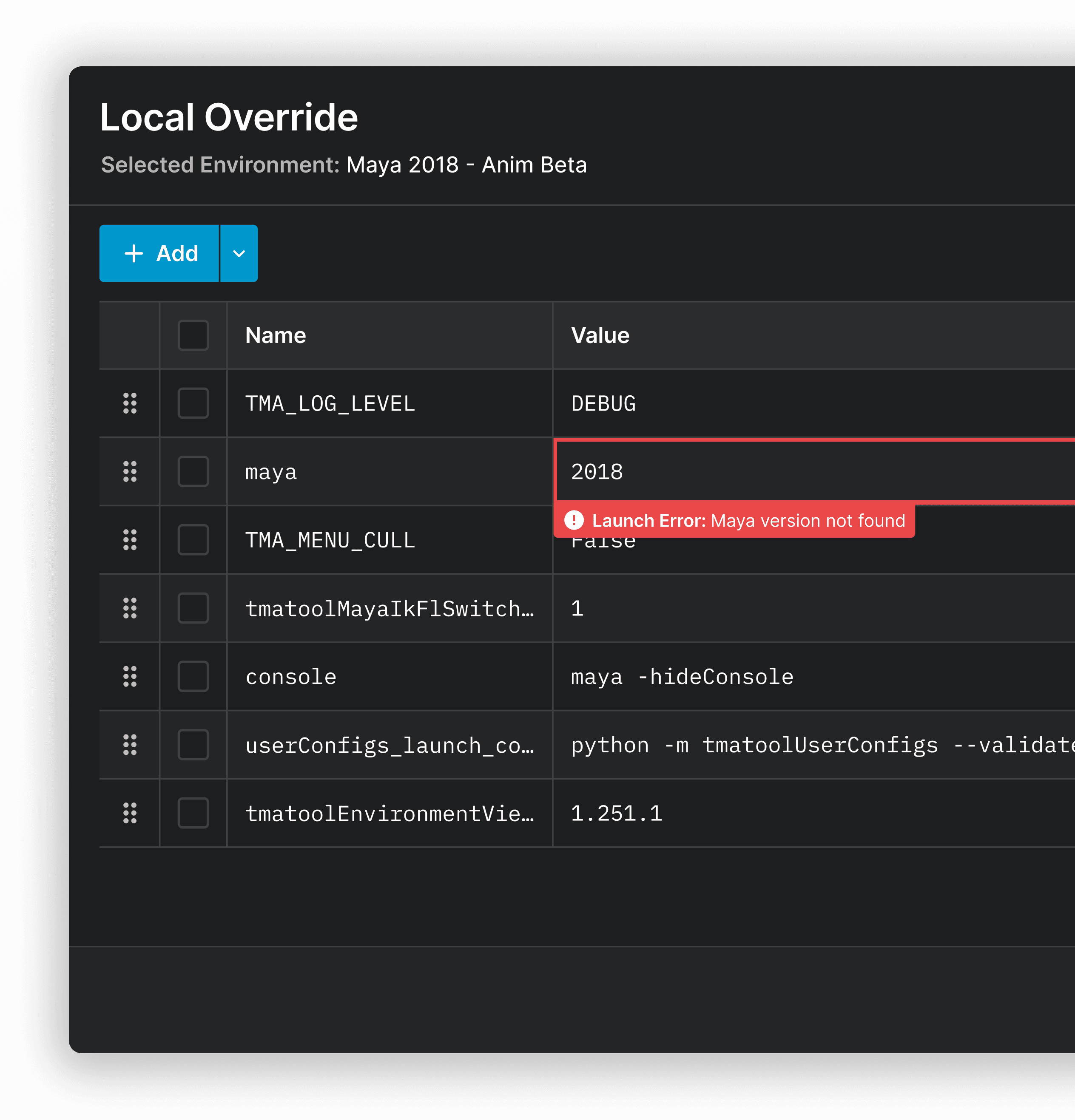
Redesigning the Admin Portal for clarity.
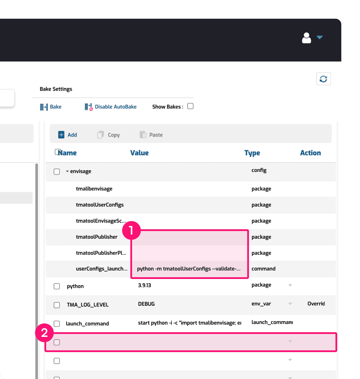
The old configuration page lacked structure, making it harder for technical staff to manage environments efficiently.
To improve this, I redesigned the layout to make key actions clearer and reduce unnecessary clutter. I also introduced placeholder text for better guidance and contextual error messages to help prevent misconfigurations.
Before
After
Streamlining navigation in the Launcher.
Previously, users had to navigate through nested accordions and multiple pages just to access their environments, creating unnecessary friction.
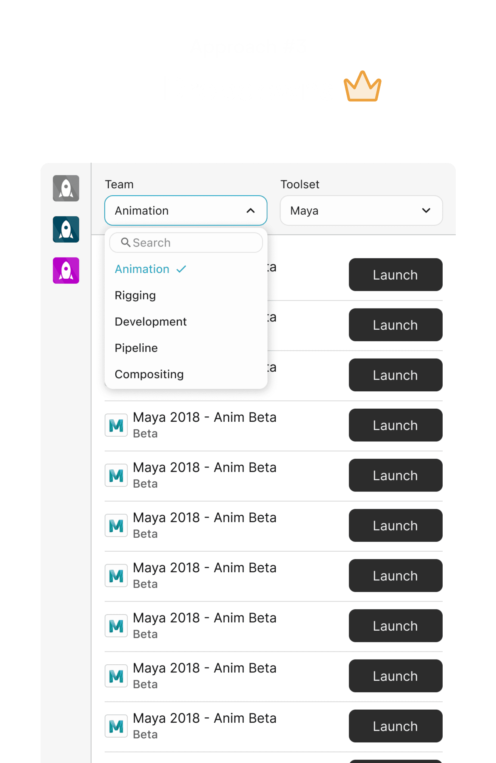
To fix this, I replaced the nested structure with dropdowns, allowing users to switch between environments within a single screen. This eliminated excessive clicking and backtracking, especially for artists working across multiple teams.

Before
After
Empowering technical artists.
And for the artists with a more technical background, new workflows were also introduced to help reduce their reliance on technical staff. They can now create, modify and edit test environments to troubleshoot issues themselves.

With redesigned flows and a new design system, a seamless handoff was key to a successful rollout.
Making sure nothing gets lost in translation.
To keep everything aligned, I created detailed usage documentation, outlining component behaviours, interactions, and use cases - ensuring engineers could implement designs accurately without second-guessing intent.
But handoff wasn’t just about walls of text. I also led regular check-ins, reviewed staging builds, and provided feedback on implementation, ensuring that as development progressed, the final product stayed true to user needs.
How did the redesign do 6 months later?
$173K
PROJECTED ANNUAL SAVINGS
By freeing up 15+ hours per week for each technical staff on our team, we’re on track to save $173K annually in support overhead - freeing them up for higher-impact work.
-43%
USER SETUP ERRORS
Environment setup errors dropped from 40% to 23%, reducing rework and production delays while making ENVLaunch more scalable as studios took on more of the setup themselves.
+35%
ADMIN PORTAL ADOPTION
Admin Portal adoption grew 35% - not just from new studios, but as existing ones shifted their workflows into the platform, driving steady monthly usage and making environment setup part of their production pipeline.
Smaller wins I wanted to share as well!
+19 System Usability Scale (SUS) Score
I ran SUS surveys before and after the redesign - boosting the Admin Portal’s score from 64 to 83. Users also reported smoother workflows and a more intuitive interface.
-20% UI Implementation Time
The design system and improved handoff process I introduced helped our engineers ship frontend features faster - saving hours each release.
+32% Launcher Navigation Speed
Streamlining the Launcher’s UI made it quicker for artists to switch between environments - especially those working across multiple teams.
Looking ahead.
We’re continuing to refine ENVLaunch by gradually updating other parts of the platform with the new design. We’re also extending the design system to our other products such as our Maya tools.
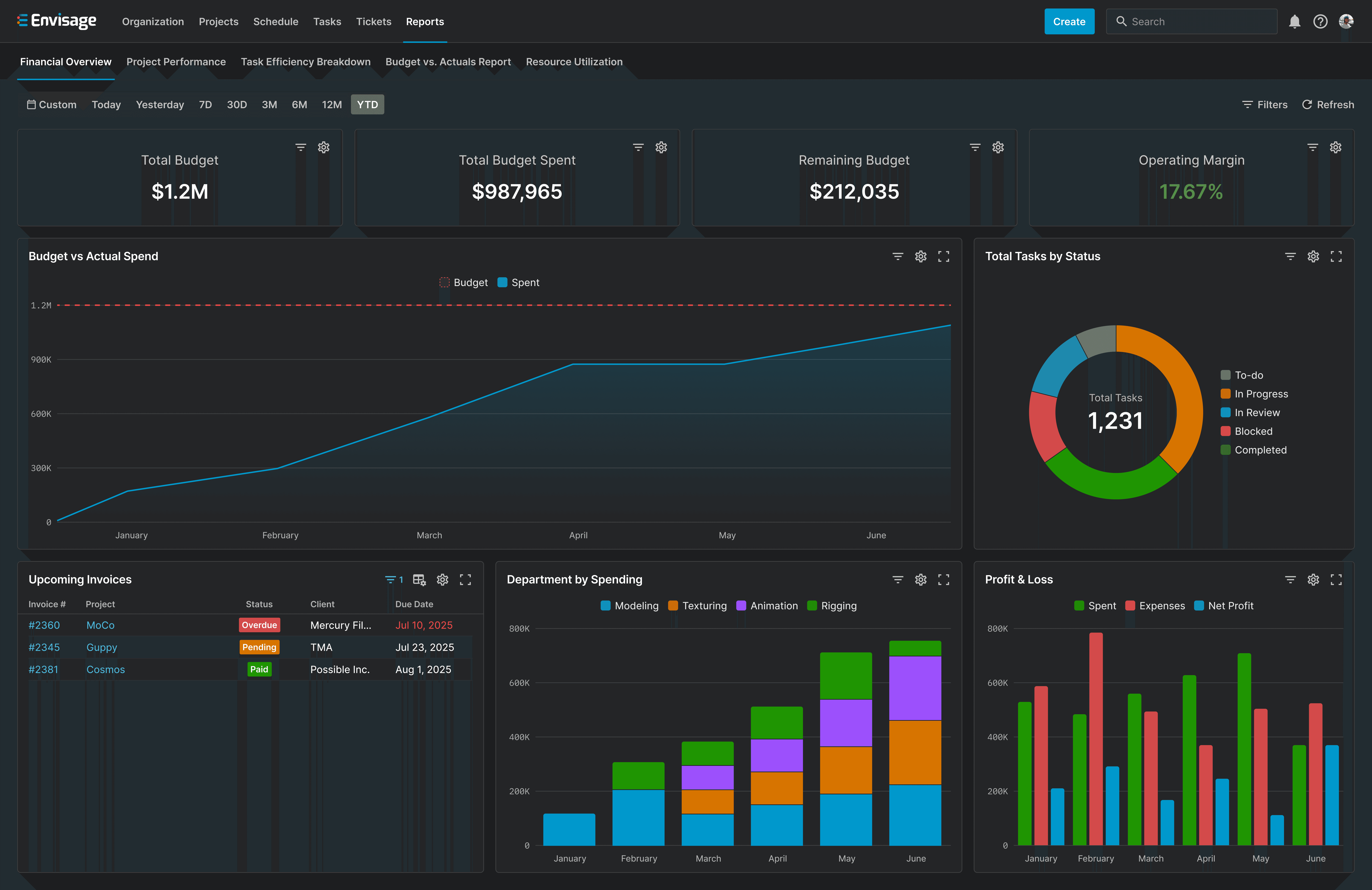
However, most of our focus has shifted to a larger challenge - Envisage, a platform designed to streamline production management at a larger scale.
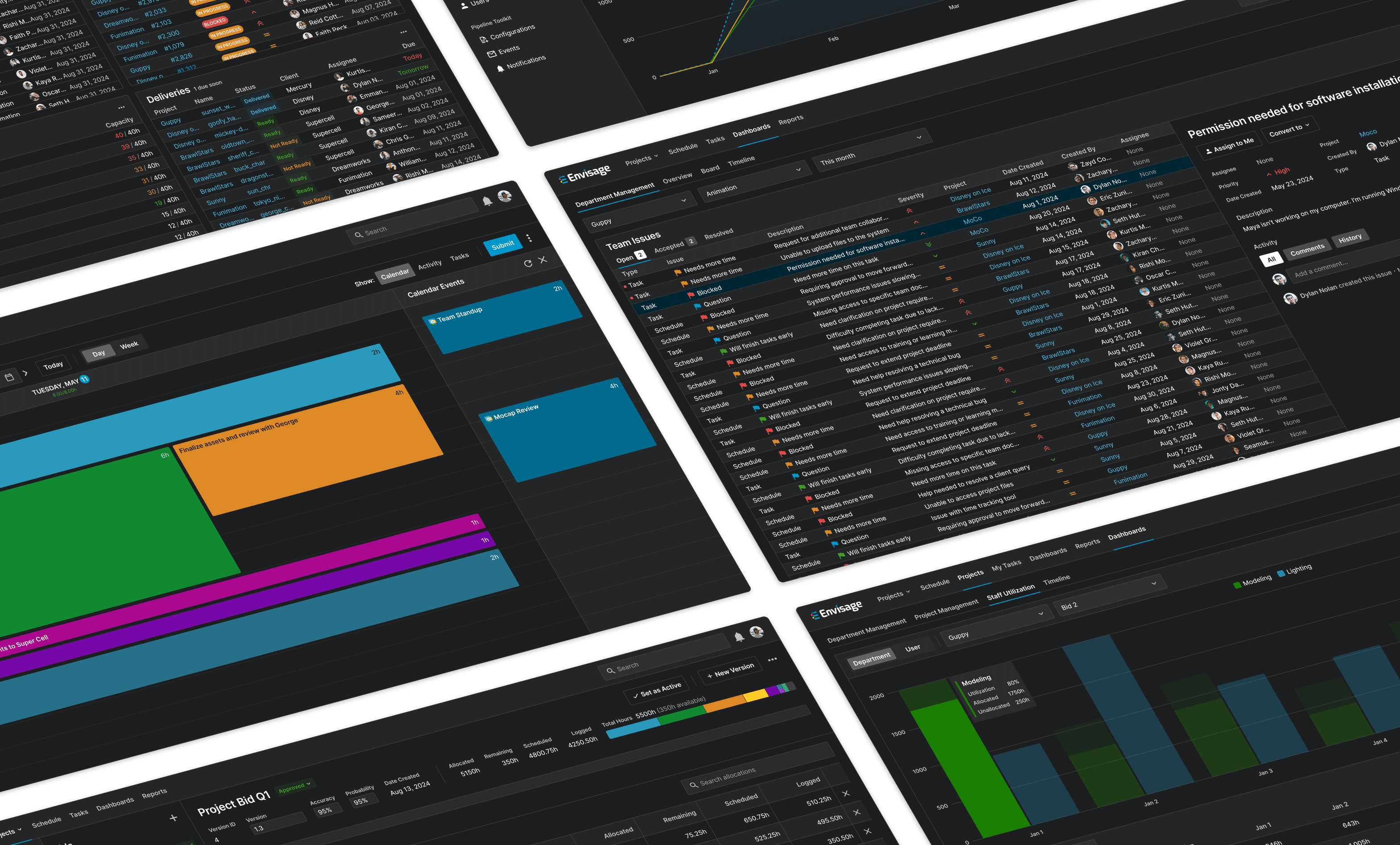
An early glimpse into Envisage
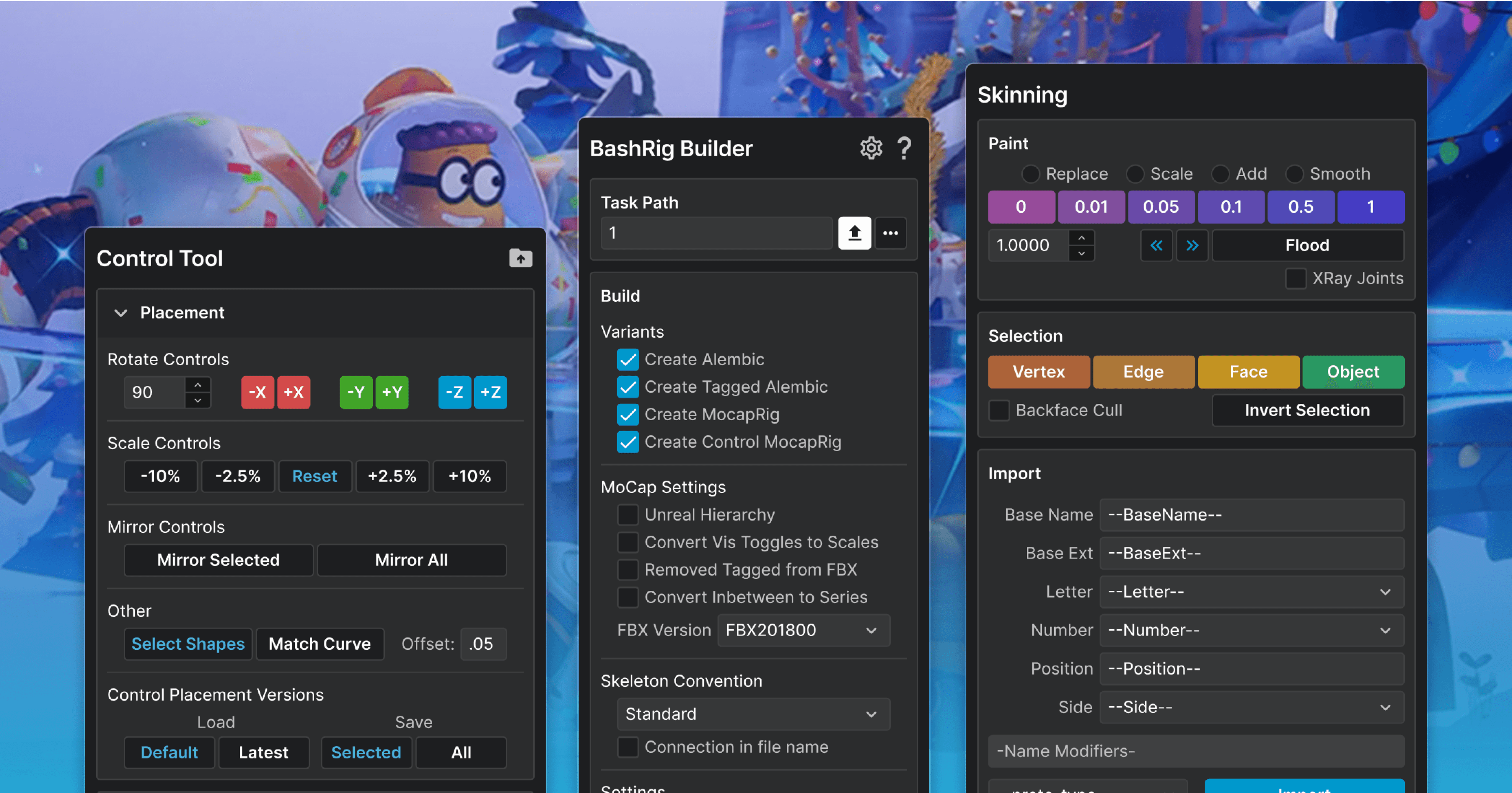
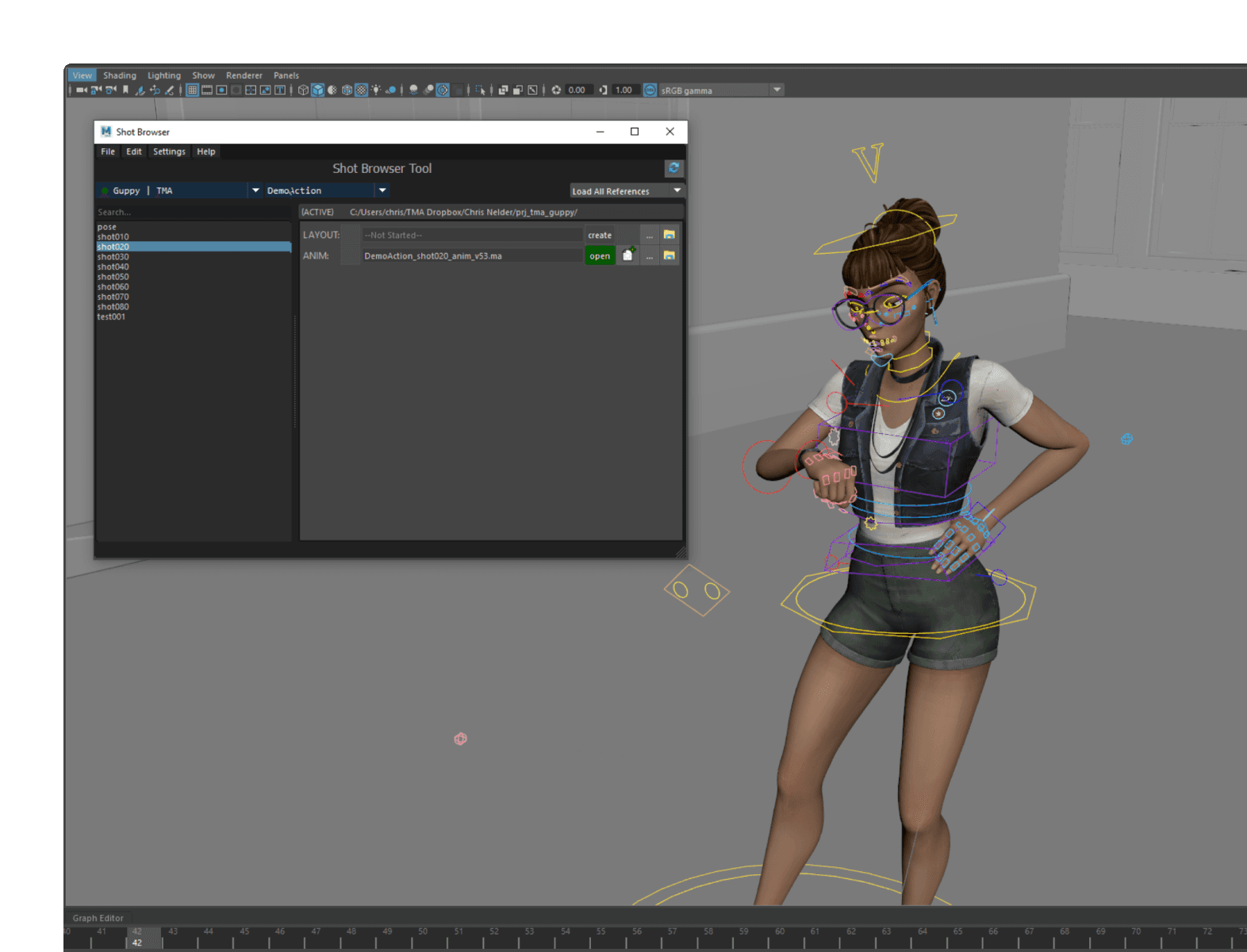
Our Maya tools getting the design system treatment
My three key takeaways from this project.
Designing with users
Since our own team relied on the tools we were building, I could gather feedback and validate ideas in real time - something I hadn’t fully experienced before as a designer.
Designing with trust
When users saw how their feedback shaped the designs, they became more engaged and invested in the tools we were building together. These better conversations ultimately led to a product that felt truly built for them.
Designing for growth
Building a design system was one of the most impactful decisions we made. Not only did we create a more cohesive experience across our ecosystem, its also accelerated design and development, setting us up for long-term growth.