Amplifii

Amplifii

Creating a marketplace
for brands and creators

Creating a marketplace for brands and creators

Bridging the gap in the creator economy.

Social media collaborations should be easy - yet they’re anything but. Brands spend ages negotiating just to land a single post, while creators struggle with inconsistent opportunities and no clear direction on how to price their work. With no easy way to connect, both sides are stuck in a frustrating cycle that makes building real partnerships harder than it needs to be.

The founder of Amplifii saw this firsthand and knew there had to be a better way. That’s when he brought Black Peak on board to turn his vision into reality - a centralized marketplace where creators could easily monetize their followings, and brands could find the right partners without all the back-and-forth.

With my e-commerce background, I led the end-to-end design process, working closely with creators and brands to gather real feedback that shaped our direction. This streamlined our approach and helped us move fast, leading to an open beta launch with promising results.

Key outcomes

+$25K Platform Transactions
+806 Fulfilled Orders
+112 Sellers Onboarded
Scope

App Design

App Design

Web Design

Web Design

What I Did

User Research

Interaction Design

Mobile Optimization

Design System

Prototyping

Usability Testing

Timeline

Q1 2024 - Ongoing

Our pre-release product trailer

The Challenge

The Challenge

The Challenge

The Challenge

Designing a marketplace that helps brands and creators form meaningful partnerships.

Laying a solid foundation.

My first priority was engaging the people who had already shown interest in the platform. To do this, I worked with the Amplifii team to design two tailored onboarding forms - one for creators (sellers) and one for brands (buyers) - both doubling as surveys shared through Instagram and X (I still prefer calling it Twitter…).

These forms weren’t just about sign-ups; they gave us critical insights into user needs. I learned what brands look for in partnerships and which offers creators receive most - like posts, comments, and stories. These findings shaped Amplifii’s core experience, ensuring we built a platform that provided real value from day one.

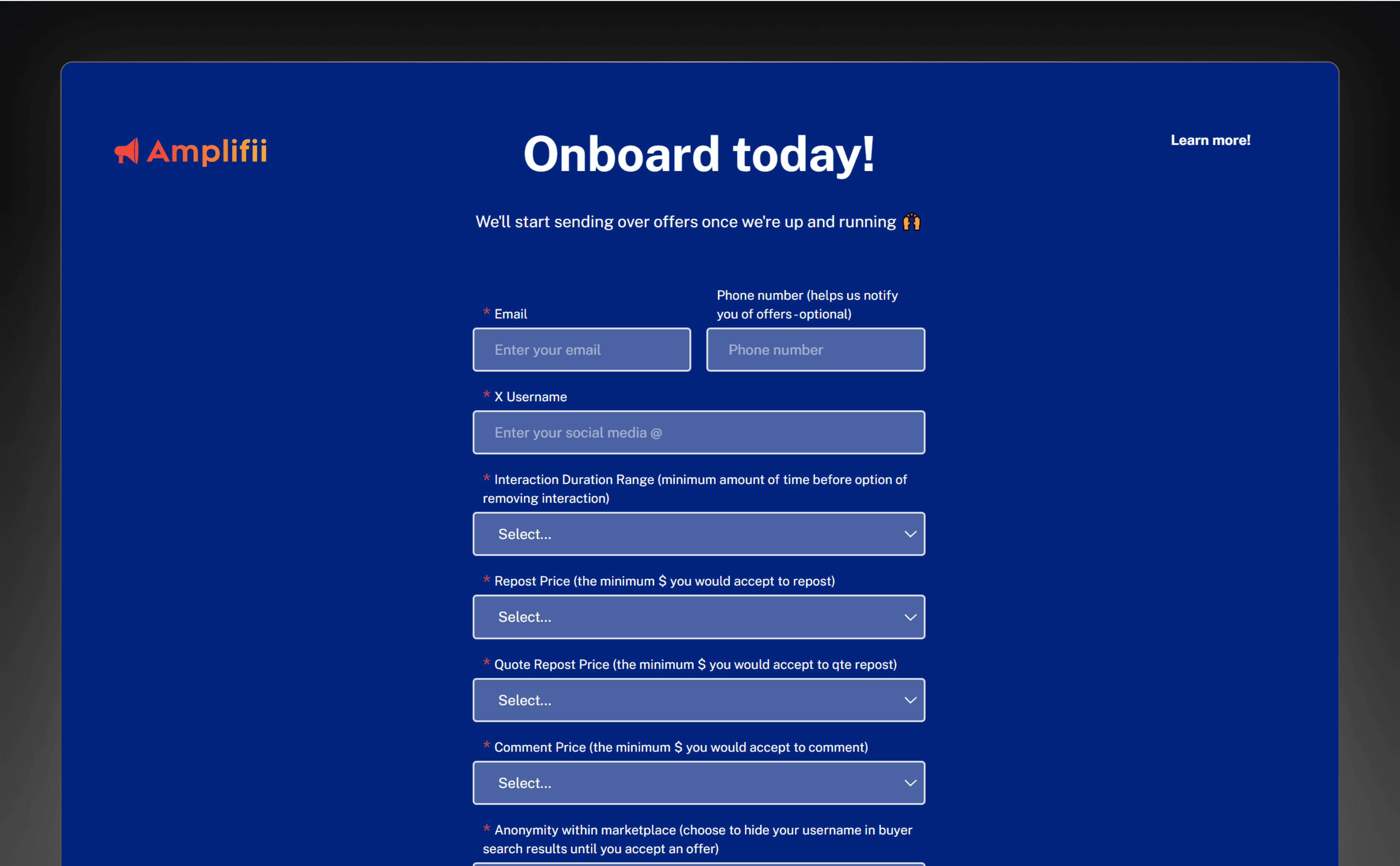
The onboarding survey that helped us shape the foundation of Amplifii's design

Some of our high-level goals for this project.

For Brands and Creators

Enable brands to connect with the right creators, while giving creators the tools to grow their business.

For Brands and Creators

Enable brands to connect with the right creators, while giving creators the tools to grow their business.

For Brands and Creators

Enable brands to connect with the right creators, while giving creators the tools to grow their business.

For Brands and Creators

Enable brands to connect with the right creators, while giving creators the tools to grow their business.

Mobile Optimization

Ensure Amplifii is fully functional and accessible on mobile by optimizing for responsiveness.

Mobile Optimization

Ensure Amplifii is fully functional and accessible on mobile by optimizing for responsiveness.

Mobile Optimization

Ensure Amplifii is fully functional and accessible on mobile by optimizing for responsiveness.

Mobile Optimization

Ensure Amplifii is fully functional and accessible on mobile by optimizing for responsiveness.

Scalable Design System

Create a scalable foundation to ensure visual consistency, accelerate development, and support future growth.

Scalable Design System

Create a scalable foundation to ensure visual consistency, accelerate development, and support future growth.

Scalable Design System

Create a scalable foundation to ensure visual consistency, accelerate development, and support future growth.

Scalable Design System

Create a scalable foundation to ensure visual consistency, accelerate development, and support future growth.

The Approach

The Approach

The Approach

The Approach

Figuring out the key pieces and how they come together.

Building the blueprint.

Drawing from my e-commerce experience, I helped the team quickly identify the essential pages needed for launch. This allowed us to establish the foundation early, so we could focus on shaping the platform’s overall structure.

From there, I leaned on survey results, feedback from the Amplifii team, and direct conversations with users to better understand our two core audiences: creators (sellers) and brands (buyers). Mapping out features based on these insights broke the project into clear, manageable phases, giving the team direction and making the entire process more structured and strategic.

Sitemap outlining the Seller Dashboard and Marketplace

Designing for a more complex transaction flow.

Unlike traditional e-commerce platforms, Amplifii’s transaction process wasn’t just a simple checkout. Buyers send an offer, sellers accept and fulfill it, and buyers confirm completion - turning it into a multi-step journey rather than a one-click purchase. A key challenge was determining when payments would be processed and when sellers would receive them.

With this added complexity, my focus was on streamlining the experience. I designed a clear, guided flow that kept both buyers and sellers moving smoothly through each step, minimizing friction and eliminating confusion.

User flows detailing the transaction process for standard interactions, and more involved ones like custom content creation

Quantifying influence with the Amplifii Score.

The Amplifii Score gives creators a way to measure their promotional power while helping brands make smarter partnership decisions. But defining the right formula wasn’t straightforward - we had to make some educated guesses.

I started by pulling from existing research, talking to creators, and identifying the metrics that mattered most. From there, we built and tested multiple scoring models, applying them to top creators in our network to see if the results aligned with their perceived influence. After fine-tuning, we used Phyllo to pull key data points - like follower count and engagement rate - to power the final score.

Integrating Phyllo’s API into our existing flows

Visualizing the platform.

With the core features and structure in place, the next step was bringing these ideas to life visually. While time was limited, I still gathered valuable feedback by having the team and a select group of users test key flows through interactive prototypes.

Seeing the wireframes in action sparked excitement - a great sign that we were heading in the right direction and a strong early validation of our approach.

Wireframes for the Marketplace and Seller Dashboard

The Final Designs

The Final Designs

The Final Designs

The Final Designs

Bringing Amplifii to life, just as brands and creators envisioned it.

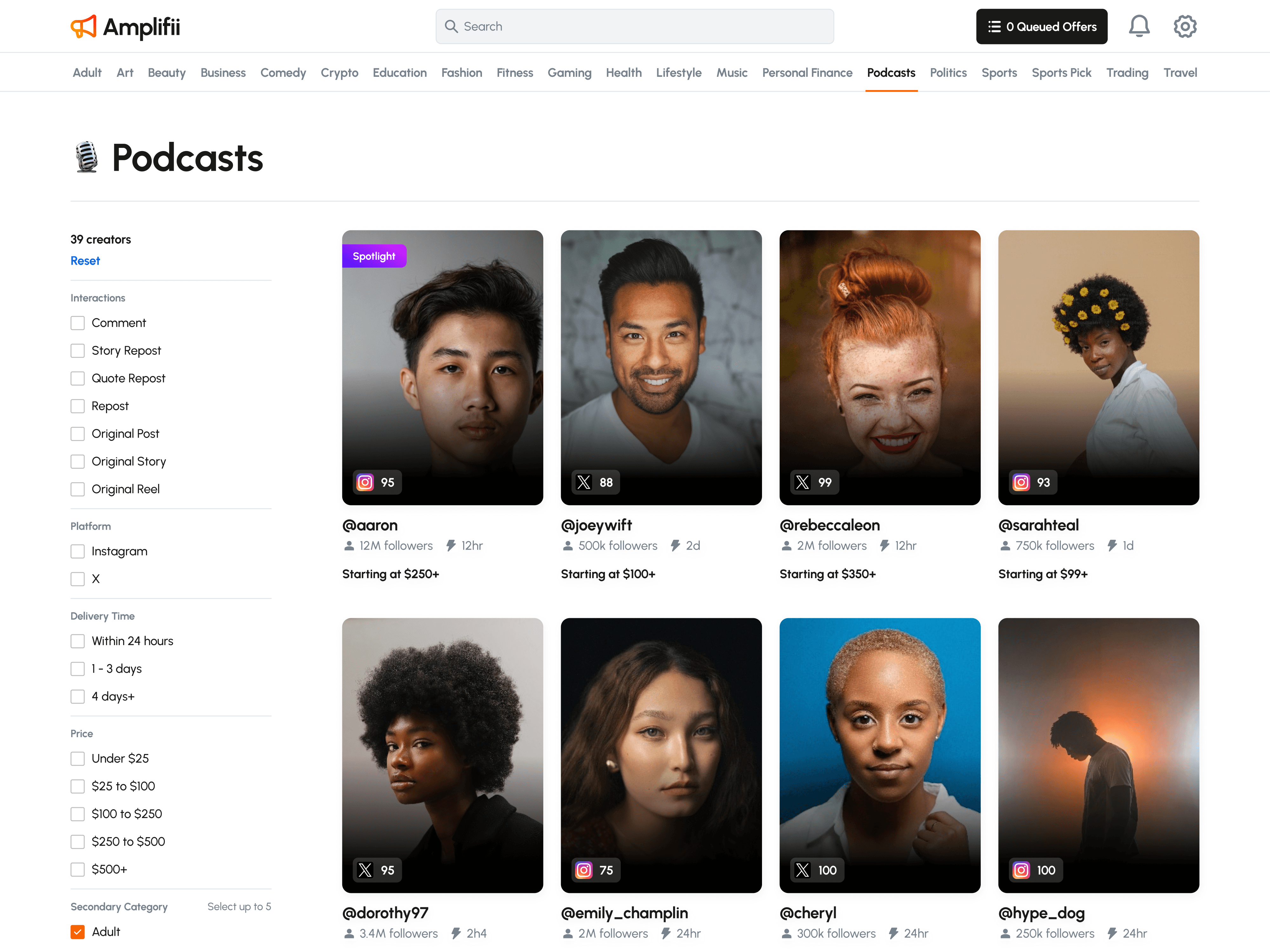
Discovering the perfect creator.

The Marketplace helps brands quickly find creators who align with their goals. Filters for industry, follower count, Amplifii Score, and other key metrics simplify discovery, allowing brands to send offers directly once they find the right match.

Discovering and sending offers to creators

Simplifying the multi-step transaction process.

I designed the transaction flow to be simple and intuitive, ensuring buyers and sellers always know what to do next. The offer detail page clearly indicates whose turn it is and what action is required, guiding users step by step from the initial offer to final delivery and payment.

Buyer POV: Confirming an offer and waiting for the seller to complete the interaction

Seller POV: Completing an interaction and waiting for buyer confirmation

Giving creators the tools to earn more.

The Seller Dashboard is a central hub where creators can manage orders, track performance, and stay on top of their earnings. It also provides pricing insights based on what similar creators are charging, allows sellers to create custom bundles for brands, and offers personalized tips on improving their Amplifii Score - all designed to help them grow their influence and maximize their earnings.

A closer look at the Seller Dashboard

A mobile-first approach.

Our survey showed that over 85% of sellers would prefer using Amplifii on their phones, wanting the flexibility to manage orders from the same device they use for social media.

While building a native mobile app was beyond the project’s scope, I focused on making the platform fully responsive. This way, creators could seamlessly access Amplifii from any device without sacrificing the experience.

Mobile-optimized design ensures users have full functionality at their fingertips

You may have noticed both light and dark modes…

Amplifii’s design adapts to its users with distinct themes for each side of the platform. The Marketplace uses a light theme to maintain visual consistency with other e-commerce platforms, making it feel familiar. Meanwhile, the Seller Dashboard features dark mode, commonly used in professional and creator tools, to help reduce eye strain as users manage their business.

This design choice came directly from the Amplifii team, ensuring each experience feels distinct and intentional. These themes also act as subtle visual cues, making it easy for users to instantly recognize whether they’re in buying or selling mode.

Several components from the design system components in both light and dark themes

I also designed Amplifii's website

The Final Hurdle

The Final Hurdle

The Final Hurdle

The Final Hurdle

Adapting to a changing landscape.

Navigating last-minute compliance changes.

Towards the end of development, we received important policy updates from Phyllo, Instagram, and X, requiring us to add extra compliance steps. Instagram’s integration with Phyllo now requires additional verification for non-professional accounts, while new FTC regulations introduced stricter disclosure requirements for advertising on X.

While necessary, these changes added friction to our onboarding process. They also raised scalability challenges, as we currently don’t have an automated way to handle these steps.

New flows were created to address these new policy changes

The Impact

The Impact

The Impact

The Impact

We launched Amplifii with an 8-week open beta, giving me the opportunity to validate design choices and uncover areas for improvement.

+$25K

PLATFORM TRANSACTIONS (USD)

During the beta, Amplifii facilitated $25K in platform transactions, an exciting milestone for us. Seeing buyers and sellers trust the platform to connect and complete orders reinforced that we were building something truly special. This early success validated not only our secure and intuitive transaction process but also the potential for Amplifii to support creators in earning meaningful income.

+806

FULFILLED ORDERS

The multi-step transaction process achieved a 94% completion rate, excluding cancellations and refunds. Feedback from users revealed that the structured workflow and clear status indicators were key to keeping their transactions on track. Sellers especially appreciated how these features simplified what could have been a complex process, making it easier to stay organized and deliver on their commitments.

+112

SELLERS ONBOARDED

Amplifii’s pre-launch excitement brought in 112 sellers during the beta, well beyond our initial target of 80. We had concerns that the extra verification steps might discourage signups, but post-launch interviews told a different story. Rather than seeing them as a barrier, sellers actually found these steps reassuring, viewing them as a sign of Amplifii’s credibility.

What's next for Amplifii?

While the early metrics are promising, beta user feedback gave us plenty of insights on what could be improved. I gathered those insights and worked with the Amplifii team to shape the next phase of development. The team is now focused on optimizing performance during peak usage, enhancing seller analytics, refining the Amplifii Score, and adding new features to improve creator discoverability.

An iOS and Android app is also in the works to bring a fully native experience to mobile. I’m excited to see how Amplifii continues to evolve as the team gets ready for the full launch!

What I learned along the way.

Friction Isn't Always the Enemy

Conventional UX wisdom says fewer steps are always better, but our beta told a different story. Instead of seeing the extra verification steps in onboarding as a hassle, users viewed them as a sign of legitimacy - making the platform feel more credible. It challenged my assumptions about friction in design and showed that, sometimes, a few extra steps can actually build trust.

Clarity Through New Lenses

Designing Amplifii’s transaction process meant looking beyond traditional e-commerce patterns. Instead of a simple checkout flow, I took inspiration from ticket management systems for status tracking and delivery apps for coordinating multiple parties. By blending these insights, I crafted a multi-step transaction process that felt intuitive - and ultimately became a feature users loved.

Staying in Sync with Our Users

This was my first time running a pre-launch onboarding survey for a completely new product, and it made a huge difference. The responses acted like handrails, guiding our decisions and helping me prioritize the features users actually wanted. Having that clarity made it so much easier to focus our efforts in the right direction.

© 2025 Eric Lee.
Designed & built by yours truly.
Thanks for stopping by ✌️
© 2025 Eric Lee.
Designed & built by yours truly.
Thanks for stopping by ✌️
© 2025 Eric Lee.
Designed & built by yours truly.
Thanks for stopping by ✌️
© 2025 Eric Lee.
Designed & built by yours truly.
Thanks for stopping by ✌️