Overview
Envisage is a project management platform that helps production studios track tasks, schedules, and budgets. But as teams relied on it more, a major gap became clear - there was no built-in way to analyze trends or make informed decisions.
To solve this, I led the design of Phase 1 of our reporting feature, turning raw data into clear, actionable insights. With better visibility into budgets and timelines, reporting is now an integrated tool that helps teams proactively manage their projects and stay on track.
$650K Projected Annual Savings
$36K Reporting Overhead Saved
Company
Team
Timeline
How Envisage evolved in 3 main phases - and why reporting became essential.
Phase 1: Laying the foundations.
Tracking production data is a challenge for most studios - spreadsheets and disconnected tools make it difficult to get a clear picture of budgets, schedules, and overall progress. This was something that we struggled with as well.
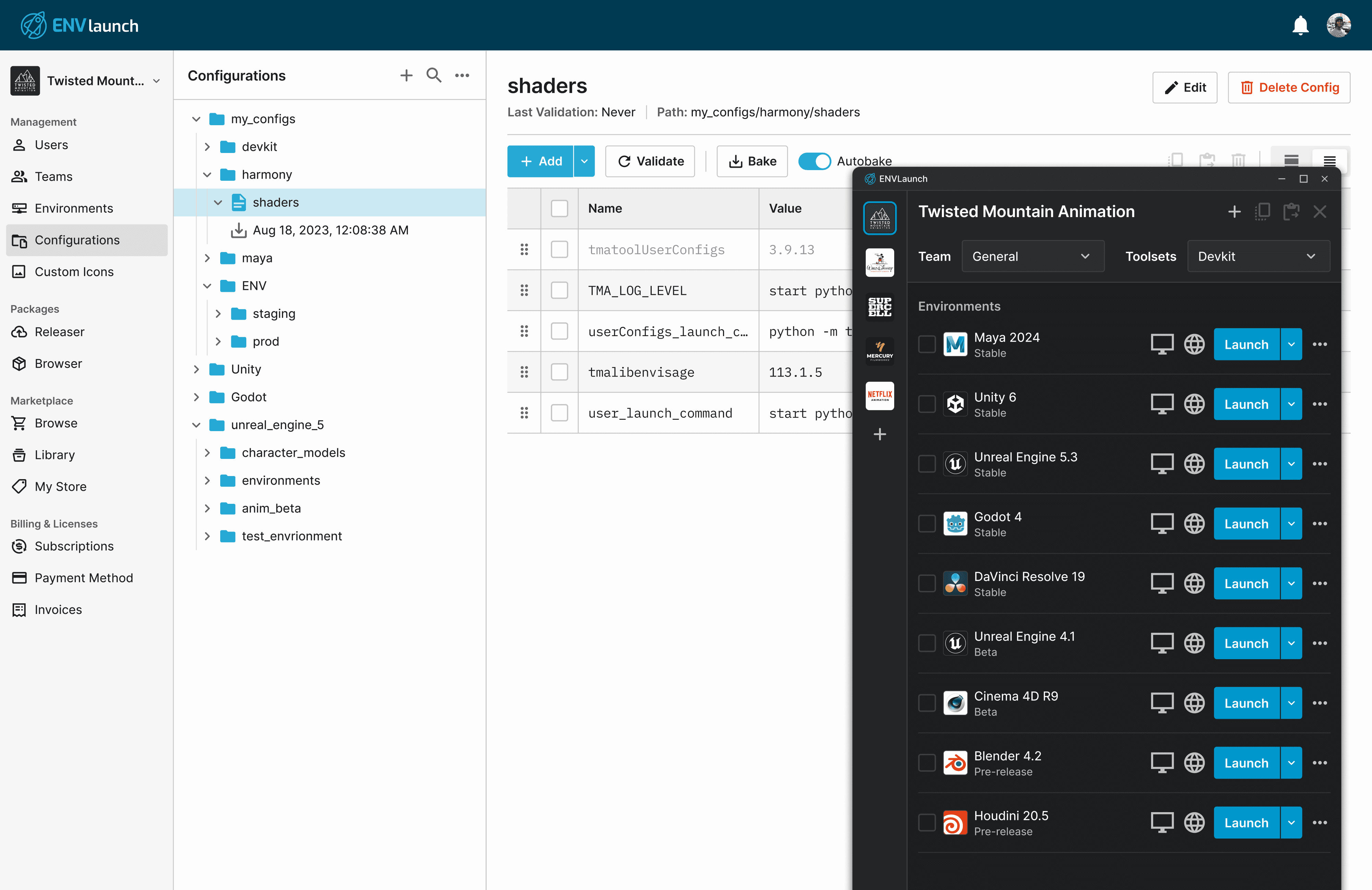
That’s why we started building Envisage in Q1 2024, with the first phase focused on centralizing this data. By creating project and budget management workflows, we gave production managers and accountants a unified workspace to stay organized and track everything in one place.

Our Bids feature to plan and track budgets
Phase 2: Expanding to task management & scheduling.
With the foundation in place, we expanded Envisage to include scheduling, time tracking, and more advanced project management features.
By this point, our team had fully transitioned to Envisage for our day-to-days. We also reached a major milestone that helped validate the platform's potential - onboarding additional studios.
Task side-panel and team schedule view
Phase 3: We have all this data, but what now?
At this stage, all production data was successfully centralized in Envisage, but making sense of it remained a challenge.
Everything was buried in tables, forcing users to dig out insights just to answer critical questions like:
Are we over budget?
Where are we losing time?
Which projects need immediate attention?
So the real question became…

How might we transform this raw data into meaningful insights that help teams make smarter, faster decisions?
To understand the biggest reporting pain points, I interviewed production managers and accountants. Three insights stood out.
Teams couldn’t analyze their data.
If a project was running behind, there was no way to tell if it was a one-time issue or a recurring pattern. Teams needed a way to spot trends and not just review static numbers.
Teams had to manually build reports.
Teams had to export data and manually build their own reports. But without a standardized approach, each report was structured differently which made cross-department collaboration difficult.
There was no single source of truth.
Different people pulled the same data at different times, leading to inconsistent numbers. These discrepancies slowed down decision-making and made it hard to know which numbers to trust.
I needed to understand what we had to work with and what tradeoffs were necessary.
Mapping our data sources.
Before I could surface meaningful insights, I worked with our engineers to determine what data points we were collecting. There was a lot to sift through, but I ultimately categorized everything into three key areas that teams relied on most - financials, time tracking, and task efficiency metrics.

Categorizing several key data points to create our foundation
Choosing the right visualizations.
With the data mapped out, my next challenge was determining how to present it. I analyzed how production managers and accountants structured their reports, identifying what they tracked and how they visualized their data.
From these insights, I designed a core set of visualizations that covered most reporting needs, ensuring it felt familiar and easy to work with.

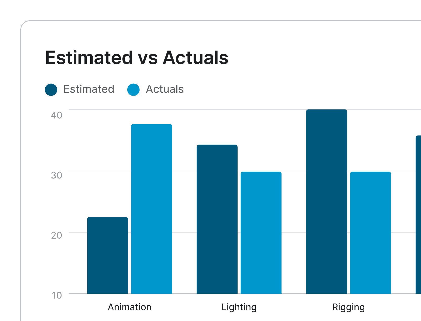

These 6 visualization types became the building blocks of our reporting system
What we couldnt implement, yet…
While I covered the most critical needs, there were several highly requested features that we couldn’t implement just yet due to feasibility.
Although we had to deprioritize these for now, we kept them in mind as we moved forward - making sure what we built had the flexibility to support these features down the line.
After gathering insights and evaluating constraints, I worked with our PM and engineers to define the priorities for Phase 1.
Pre-built first, customization later.
Prioritize a core set of reports that production managers and accountants could immediately use.
Make it interactive.
Add interactivity like filters, date selection, and other parameters so users can refine their insights without needing full customization right away.
Laying the groundwork.
Because customization will be critical later, we need to build Phase 1 as a scalable foundation to support custom dashboards and user-defined data sources in the down the line.
Validating layouts and refining interactions based on user feedback.
Structuring the initial layouts.
I worked with a subset of production managers and accountants to structure the initial layouts - focusing on how data should be organized and surfaced.
Once I had a solid foundation, I expanded testing to a broader group to see if they could actually use these reports to make decisions.
Since I couldn’t populate prototypes with real data, I filled them with realistic values to create a more accurate experience
Giving users more flexibility.
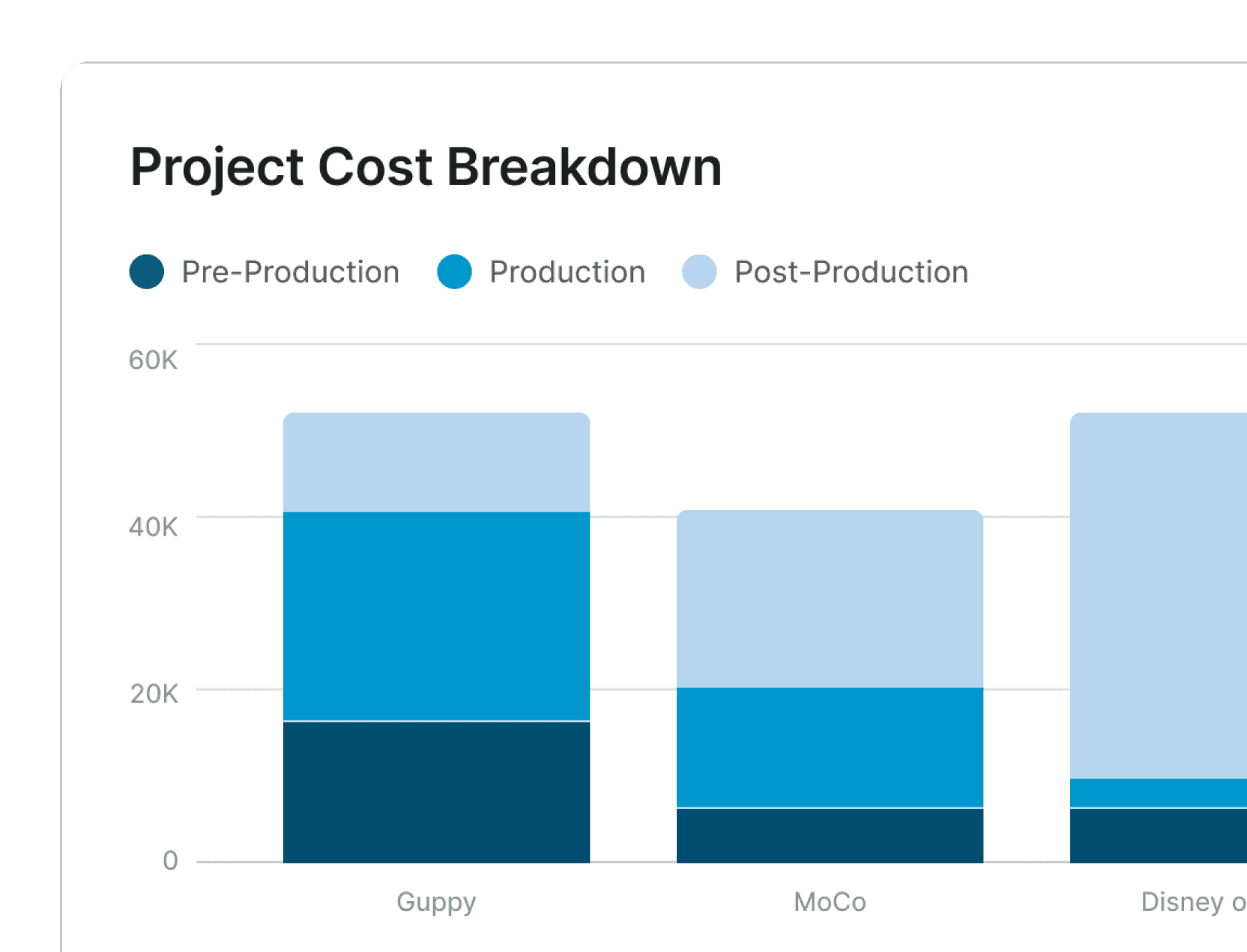
One production manager preferred donut charts for high-level budget breakdowns, while others found stacked bar charts better for tracking changes over time. This opened discussions about giving users more control over how they viewed their data.
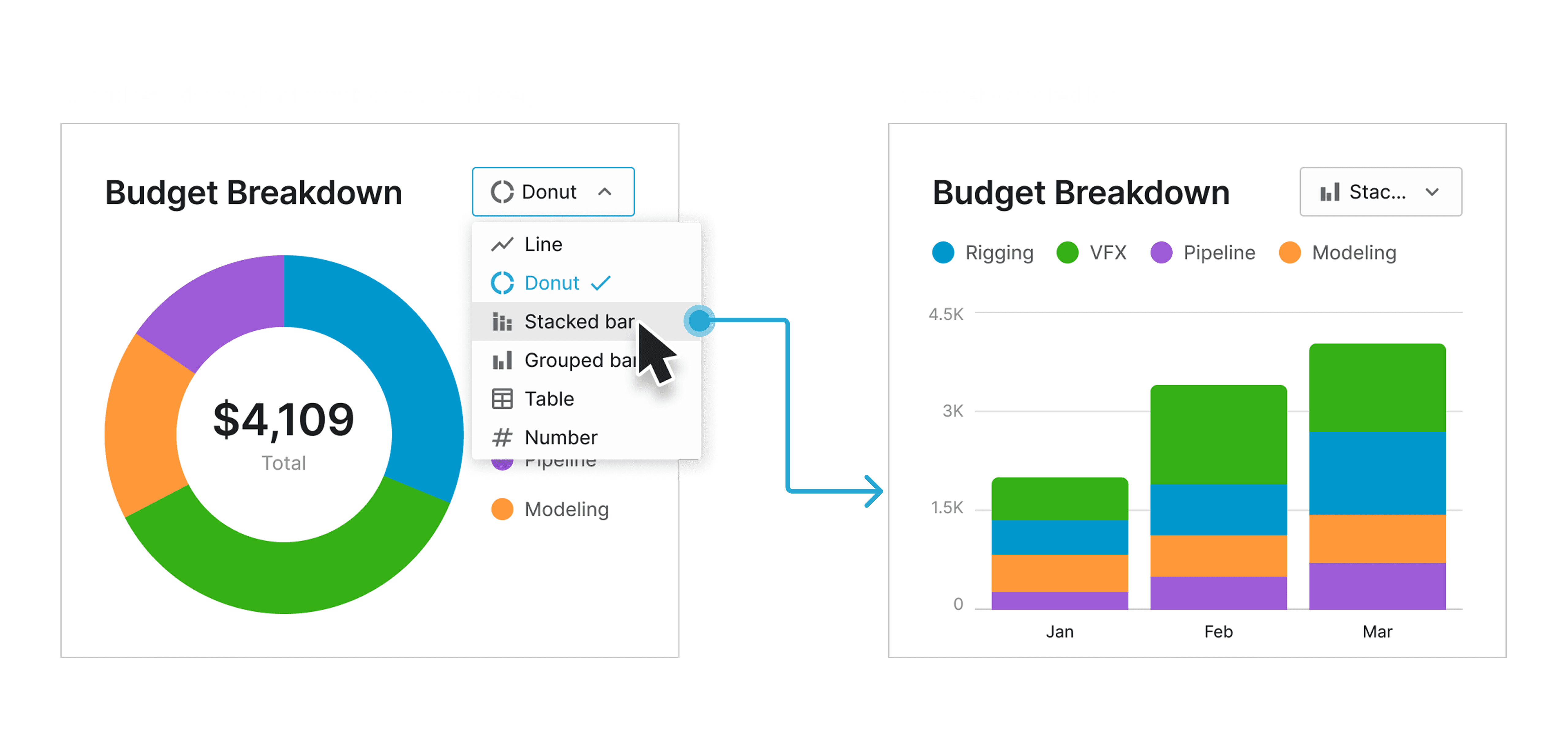
Changing chart types
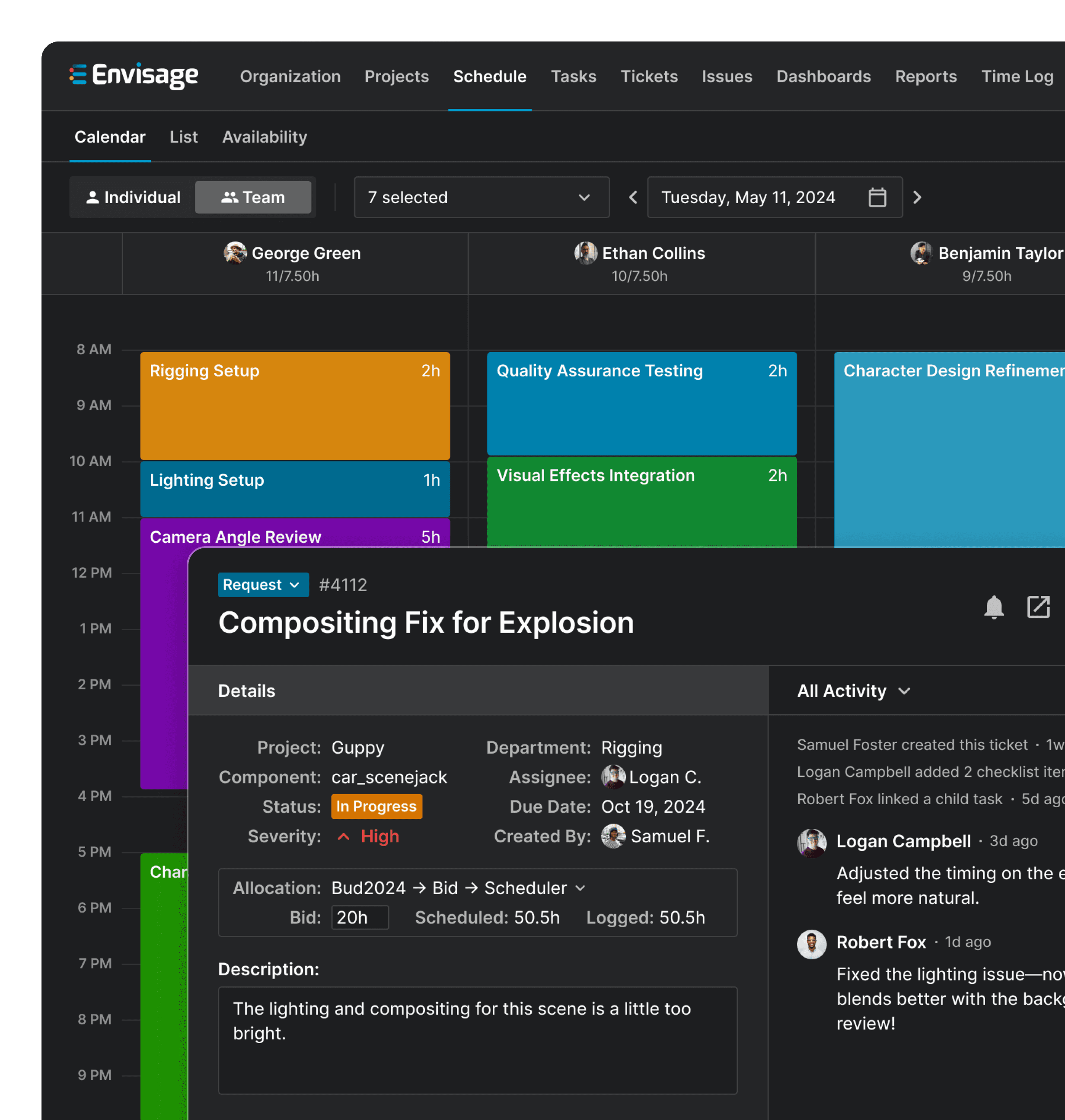
Some users needed a way to drill deeper.
Charts provided quick insights, but when I asked accountants how they would use the reports, they all had the same question - “Where’s the data coming from?” They needed to see the exact numbers behind the graphs to verify calculations and dig deeper.

Expanding a chart to see the numbers behind it
While many of the changes were easy to implement, there were a few design concerns I brought up to the team.
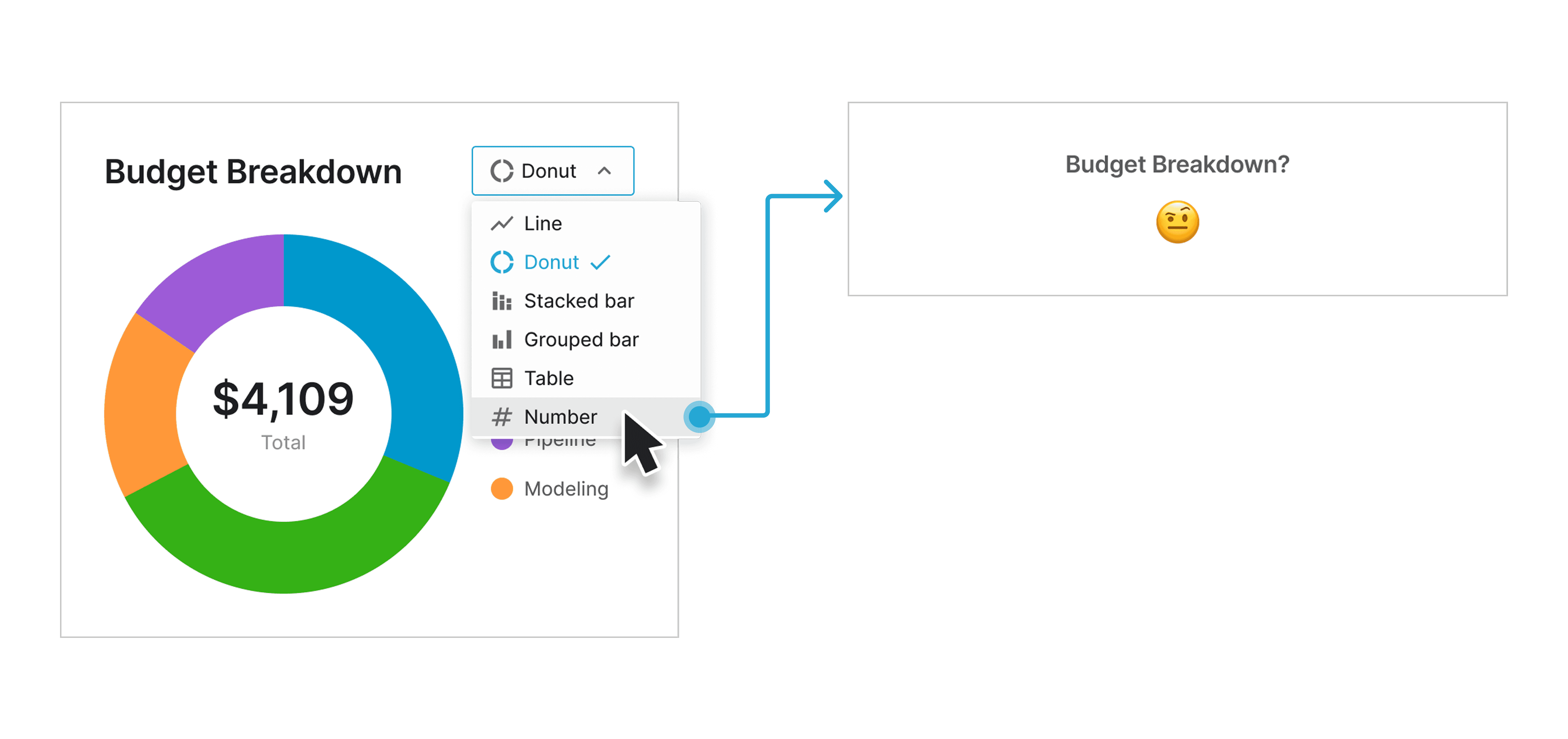
Not all chart types are compatible.
Not all data comparisons worked with every chart type. For example, multiple data points couldn’t simply be condensed into a single metric without losing critical insights.
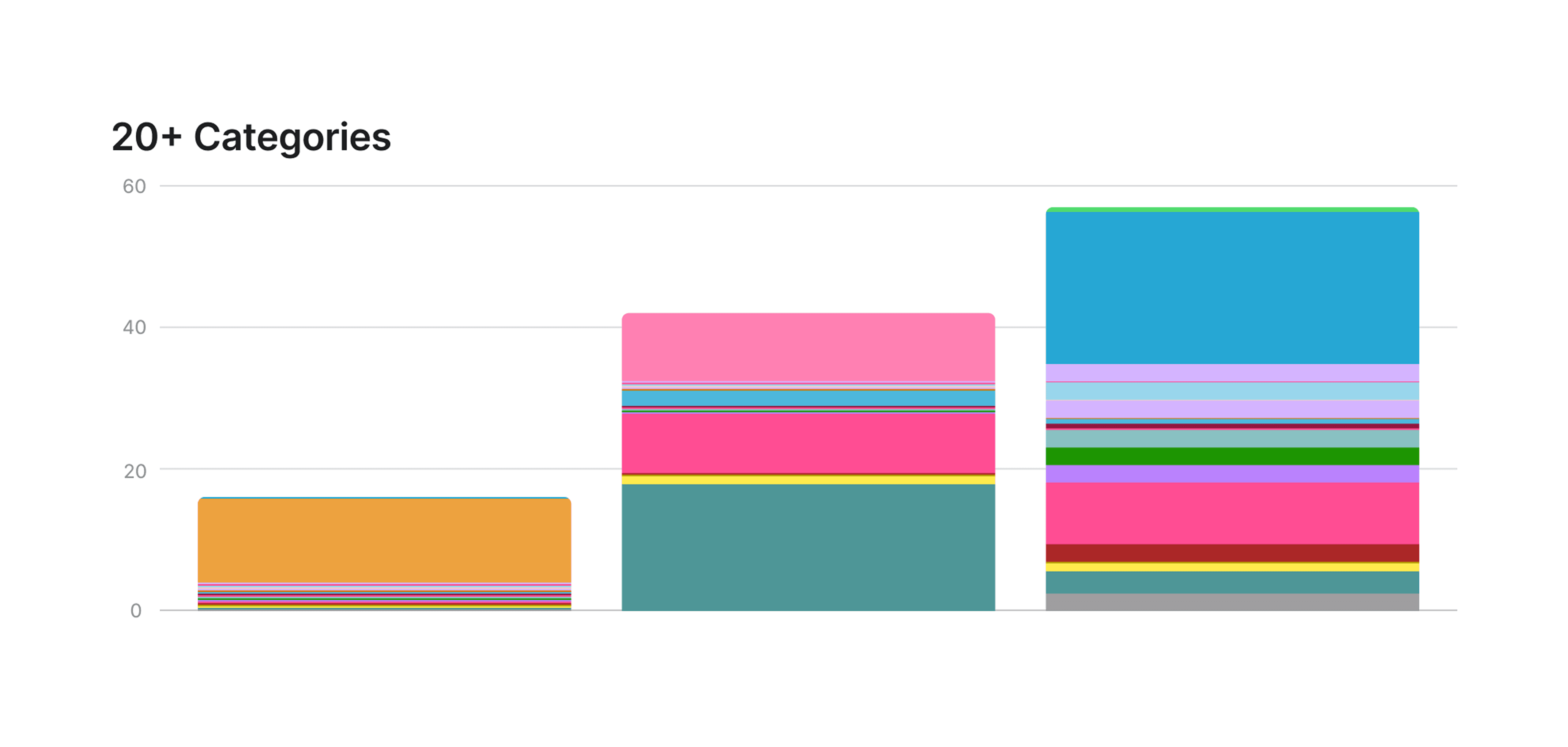
Too much flexibility could harm analysis.
Donut charts were great for broad comparisons, but converting them into stacked bar charts with too many categories resulted in cluttered visuals, making the data harder to analyze.
Setting constraints to keep insights clear.
To prevent users from unintentionally creating reports that were difficult to interpret, I defined where flexibility made sense and where constraints were necessary. This ensured that users could customize their reports while keeping key insights clear, actionable, and easy to analyze.
From scattered data to reports that teams can actually use.
Better visibility, smarter decisions.
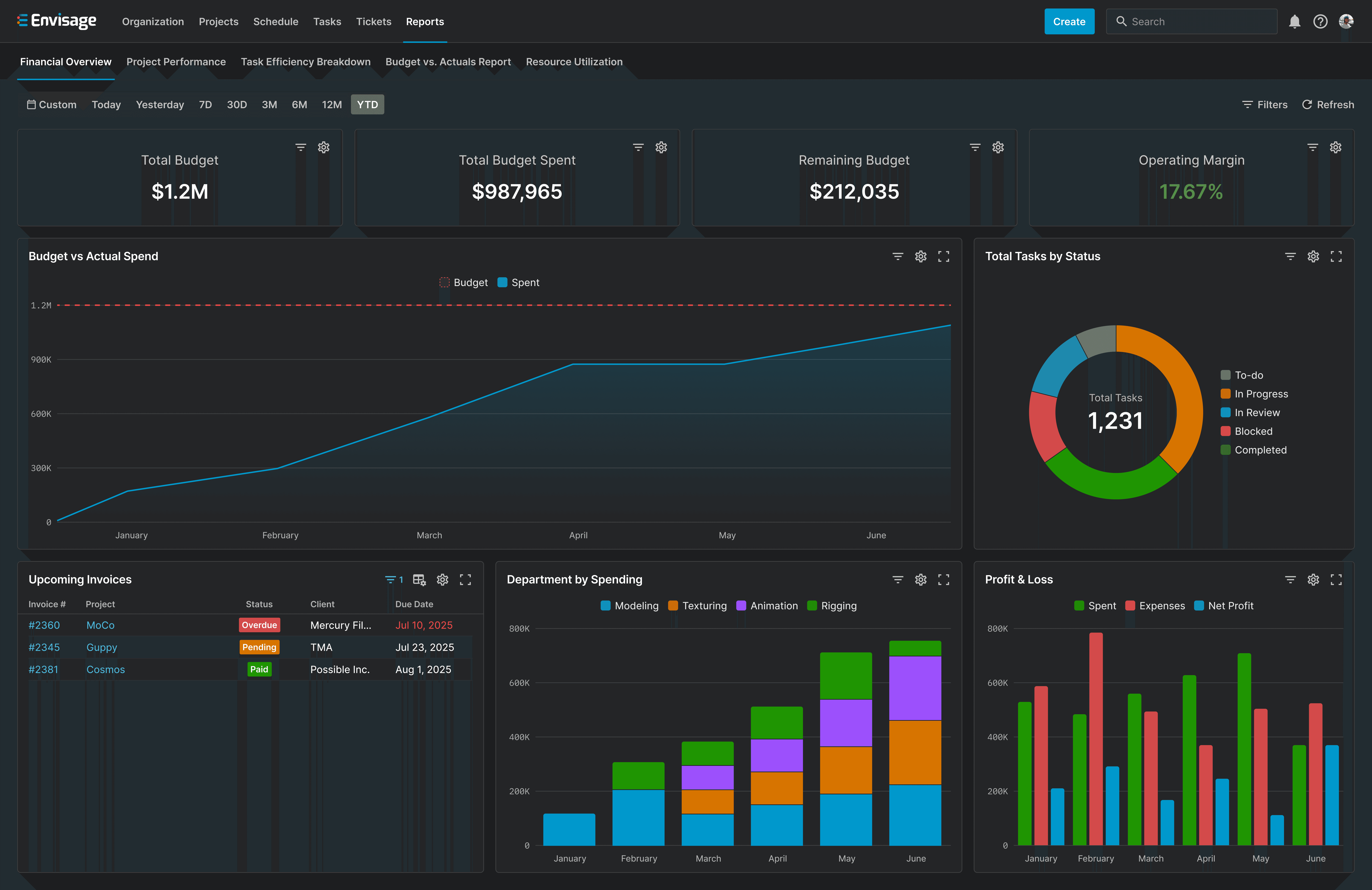
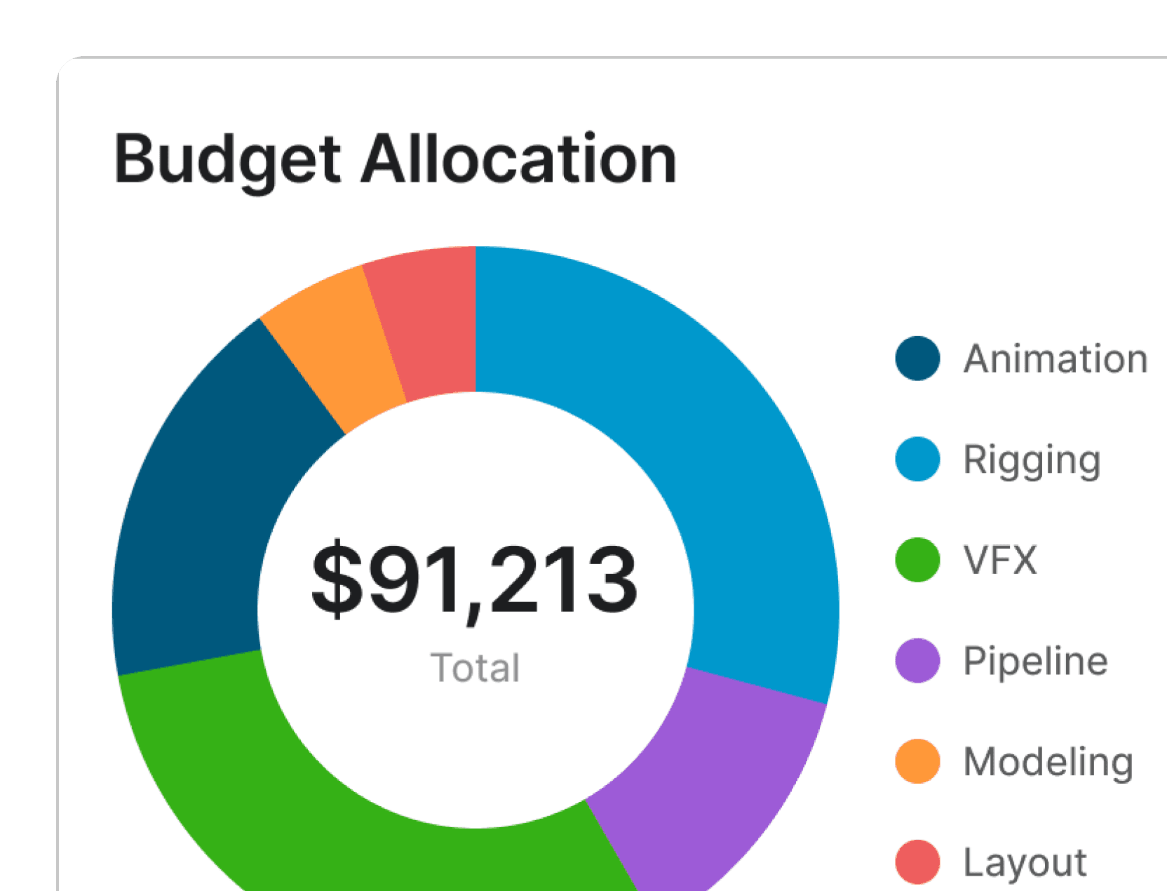
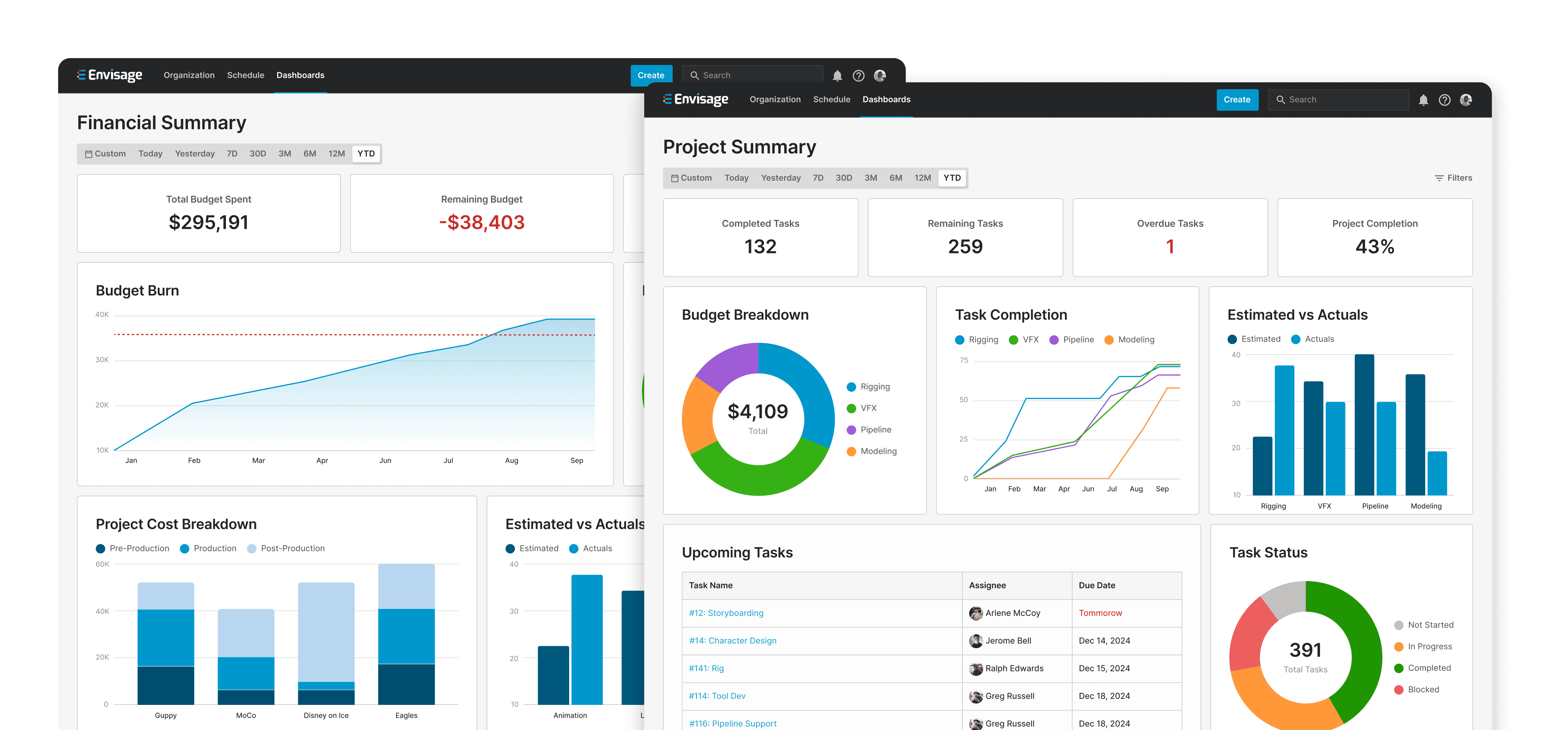
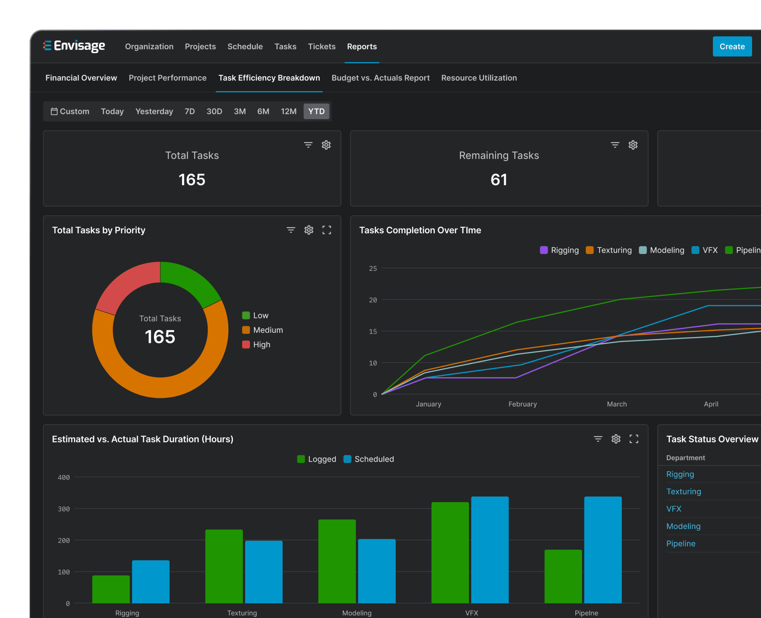
After multiple iterations and refinements, I designed five pre-built reports that help teams quickly make sense of their data. Each report combines charts, tables, and key metrics to present information in a way that is both digestible and actionable.
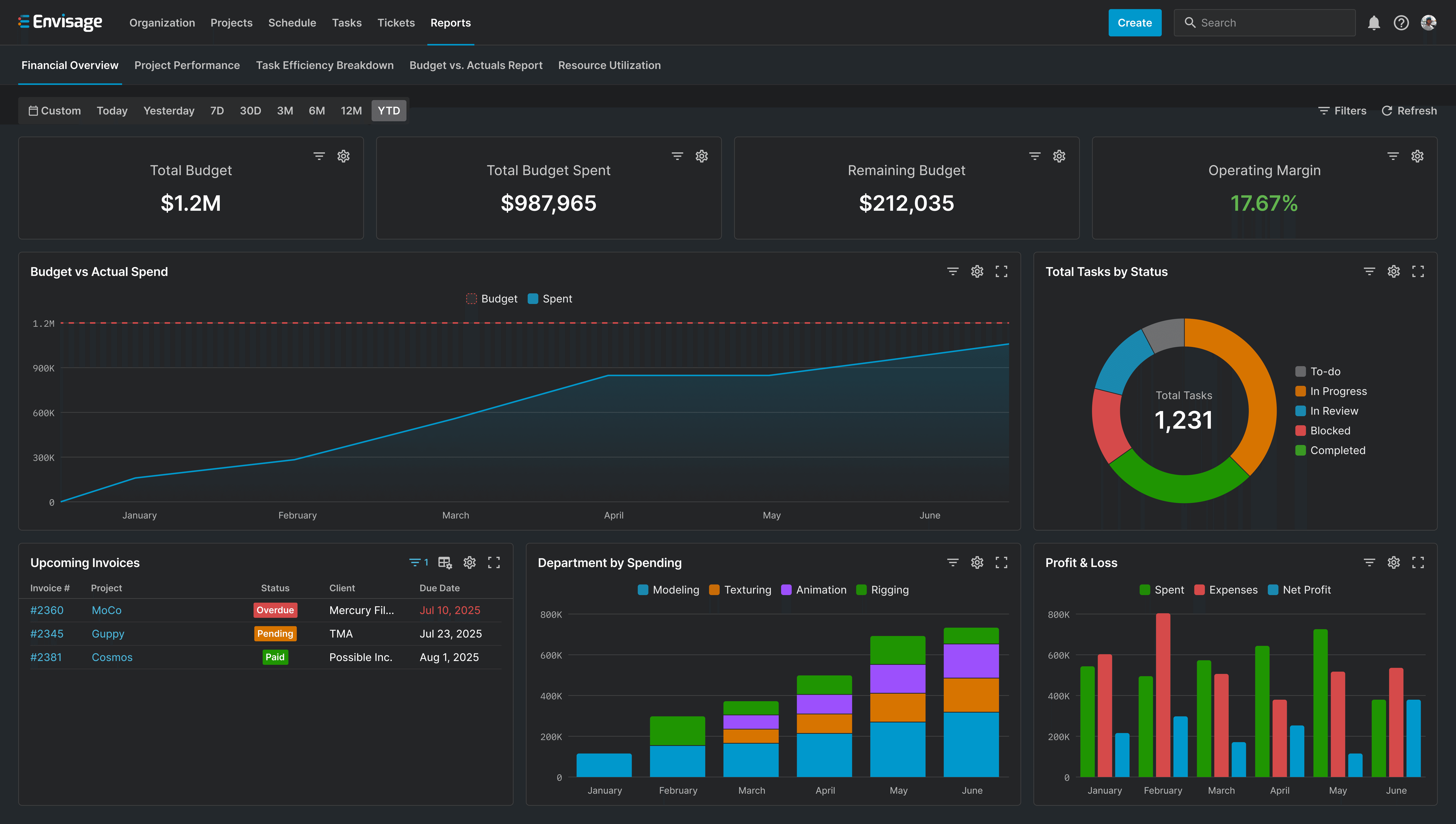
The Financial Overview Report to track budgets at a glance
Giving teams more control for deeper insights.
While more customization features are planned for the future, I made sure teams have enough flexibility now to tailor reports to their needs.
Prototype of the interactive features
While this project is still ongoing, we're already projecting $650K in annual savings just 3 months after launch.
Envisage now powers reporting for mid to large sized studios, including ours.
While I only had access to detailed metrics from our own studio, the impact was clear. We reduced project overspending by ~15%, saving an estimated $55K per project. Based on our typical production volume, this translates to an estimated $650K in annual savings.
We’re also on track to save our production managers and accountants 300+ hours annually, eliminating over $36K in manual reporting overhead.
As our CFO put it: “For the first time, I don’t have to chase down a dozen spreadsheets to figure out if we’re on budget.”
These reports have set a strong foundation, but there's still a lot to learn before I fully understand its long-term impact.
Here are some of the things I'll be monitoring over the next few months.
The next evolution of our reporting feature.
One of the biggest requests from users has been more flexibility in reporting, so that’s exactly what I’m working on - customizable dashboards. Teams will be able to create layouts, choose data sources, and structure reports in a way that works best for them.
This is a big step toward making reporting more than just something teams check, but a tool that helps them make smarter decisions and drive better project outcomes.
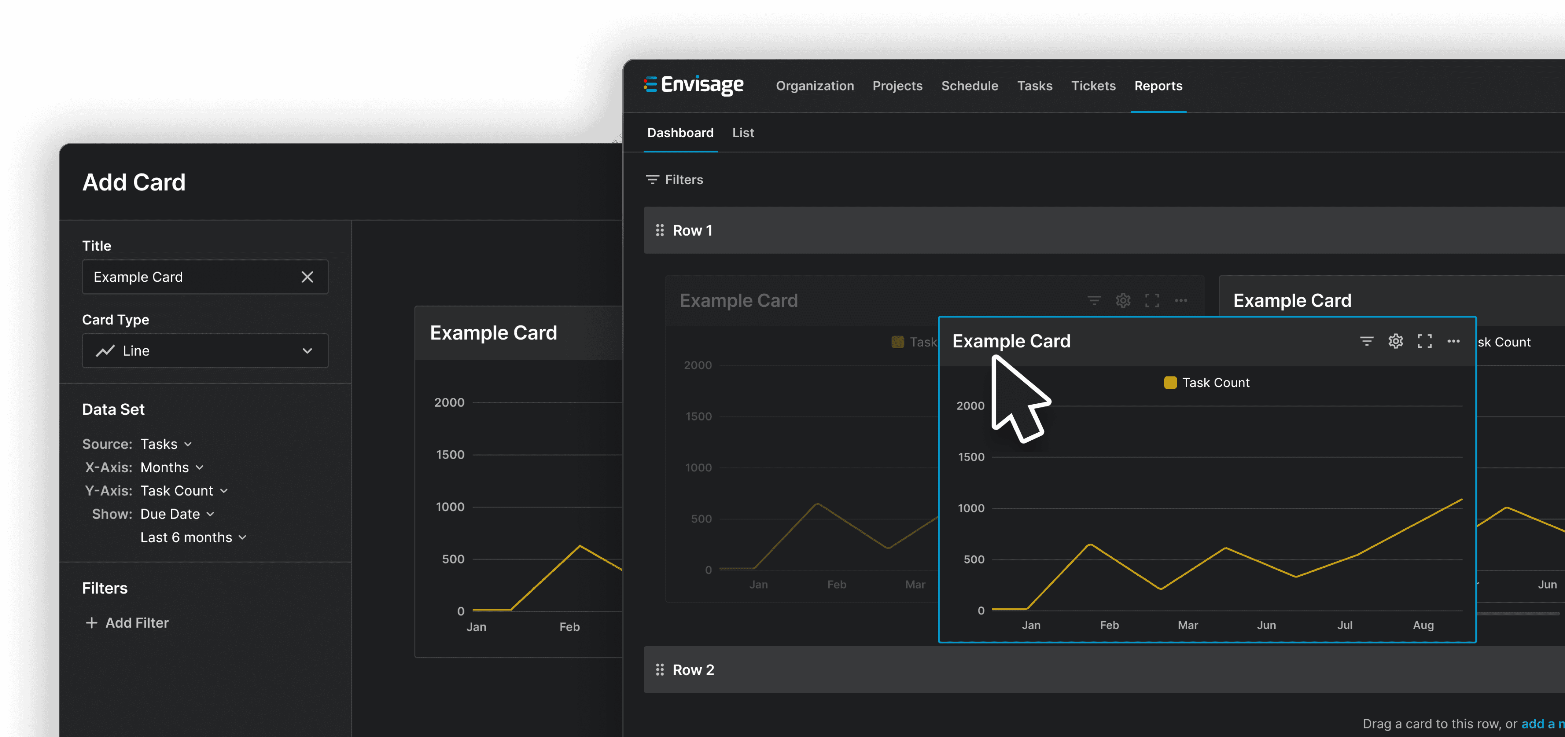
Early mockups of our customizable dashboards